如何将lightGalley.js与多行一起使用? [英] How can I use lightGalley.js with multiple rows?
问题描述
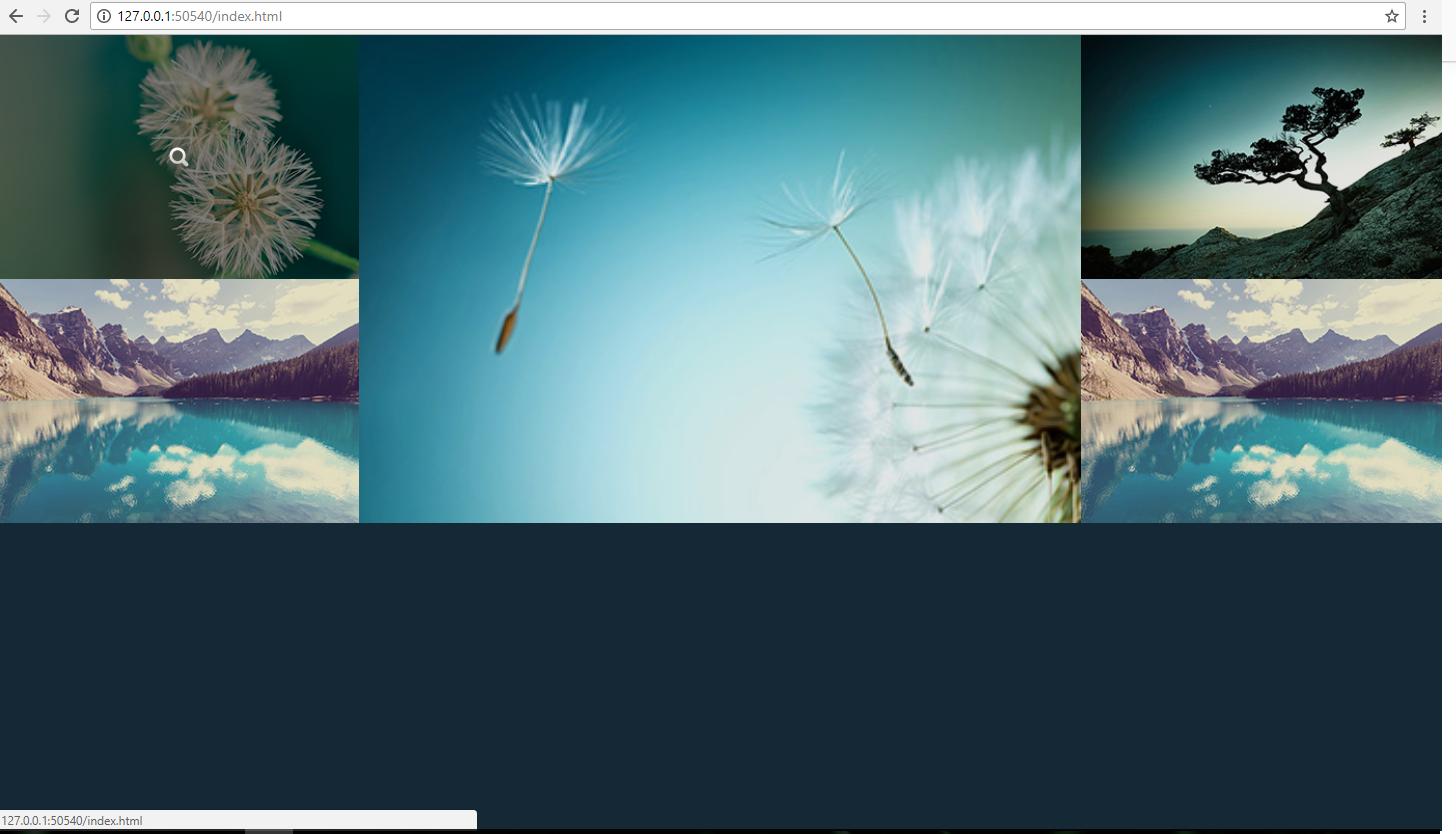
大家好! 我一直在为朋友创建的此网页上苦苦挣扎.我想收藏他的照片.我正在使用 lightGallery.js ,但是很遗憾,我在途中遇到了一些问题. 这是它现在的外观图像.
Hello guys! I have been stuggling for a while with this web page I'm creating for a friend. I want to make a portfolio of his photographs. I am using lightGallery.js for it but unfortunately I have encountered some issues on the way. Here's the image of how it looks right now.
我正在使用Bootstrap使其成为类似拼贴的画廊,但我只能使用多行.
I am using Bootstrap to make it a collage-like gallery but I cannot use more than one row.
<div class="demo-gallery">

<div class="row" id="lightgallery">
  <div class="col-xs-12 col-sm-6 col-md-3 col-lg-3" data-responsive="https://sachinchoolur.github.io/lightgallery.js/static/img/1-375.jpg 375, https://sachinchoolur.github.io/lightgallery.js/static/img/1-480.jpg 480, https://sachinchoolur.github.io/lightgallery.js/static/img/1.jpg 800" data-src="https://sachinchoolur.github.io/lightgallery.js/static/img/1-1600.jpg"
  data-sub-html="<h4>Fading Light</h4><p>Classic view from Rigwood Jetty on Coniston Water an old archive shot similar to an old post but a little later on.</p>">
    <a href="">
      <img class="img-responsive" src="https://sachinchoolur.github.io/lightgallery.js/static/img/thumb-1.jpg">
      <div class="demo-gallery-poster">
        <img src="https://sachinchoolur.github.io/lightgallery.js/static/img/zoom.png">
      </div>
    </a>
  </div> ...
如果我将<div class="row">放在ID为 lightgallery 的div中,则图像滑块将不再打开.
我检查了项目中包含的所有 .js 文件,它们似乎都没有指向具有 lightGallery id的元素的指针.
If I put a <div class="row"> inside the div with the id of lightgallery, the image slider won't open up any more.
I checked all of the .js files included in the project and none of them seemed to have any pointers to an element with the lightGallery id.
您能帮我解决这个问题吗?预先谢谢你.
Could you help me outsmart this problem? Thank you in advance.
body {
  background-color: #152836;
  color: #eee;
  font-family: "Open Sans", "Helvetica Neue", Helvetica, Arial, sans-serif
}

.img-responsive {
  width: 100% !important;
}

.demo-gallery>div {
  margin: 0;
  text-align: center;
}

.row div {
  padding: 0;
}

.demo-gallery>div>div a {
  display: block;
  overflow: hidden;
  position: relative;
}

.demo-gallery>ul>li a>img {
  -webkit-transition: -webkit-transform 0.15s ease 0s;
  -moz-transition: -moz-transform 0.15s ease 0s;
  -o-transition: -o-transform 0.15s ease 0s;
  transition: transform 0.15s ease 0s;
  -webkit-transform: scale3d(1, 1, 1);
  transform: scale3d(1, 1, 1);
  height: 100%;
  width: 100%;
}

.demo-gallery>div>div a:hover>img {
  -webkit-transform: scale3d(1.1, 1.1, 1.1);
  transform: scale3d(1.1, 1.1, 1.1);
}

.demo-gallery>div>div a:hover .demo-gallery-poster>img {
  opacity: 1;
}

.demo-gallery>div>div a .demo-gallery-poster {
  background-color: rgba(0, 0, 0, 0.1);
  bottom: 0;
  left: 0;
  position: absolute;
  right: 0;
  top: 0;
  -webkit-transition: background-color 0.15s ease 0s;
  -o-transition: background-color 0.15s ease 0s;
  transition: background-color 0.15s ease 0s;
}

.demo-gallery>div>div a .demo-gallery-poster>img {
  left: 50%;
  margin-left: -10px;
  margin-top: -10px;
  opacity: 0;
  position: absolute;
  top: 50%;
  -webkit-transition: opacity 0.3s ease 0s;
  -o-transition: opacity 0.3s ease 0s;
  transition: opacity 0.3s ease 0s;
}

.demo-gallery>div>div a:hover .demo-gallery-poster {
  background-color: rgba(0, 0, 0, 0.5);
}

.demo-gallery .justified-gallery>a>img {
  -webkit-transition: -webkit-transform 0.15s ease 0s;
  -moz-transition: -moz-transform 0.15s ease 0s;
  -o-transition: -o-transform 0.15s ease 0s;
  transition: transform 0.15s ease 0s;
  -webkit-transform: scale3d(1, 1, 1);
  transform: scale3d(1, 1, 1);
  height: 100%;
  width: 100%;
}

.demo-gallery .justified-gallery>a:hover>img {
  -webkit-transform: scale3d(1.1, 1.1, 1.1);
  transform: scale3d(1.1, 1.1, 1.1);
}

.demo-gallery .justified-gallery>a:hover .demo-gallery-poster>img {
  opacity: 1;
}

.demo-gallery .justified-gallery>a .demo-gallery-poster {
  background-color: rgba(0, 0, 0, 0.1);
  bottom: 0;
  left: 0;
  position: absolute;
  right: 0;
  top: 0;
  -webkit-transition: background-color 0.15s ease 0s;
  -o-transition: background-color 0.15s ease 0s;
  transition: background-color 0.15s ease 0s;
}

.demo-gallery .justified-gallery>a .demo-gallery-poster>img {
  left: 50%;
  margin-left: -10px;
  margin-top: -10px;
  opacity: 0;
  position: absolute;
  top: 50%;
  -webkit-transition: opacity 0.3s ease 0s;
  -o-transition: opacity 0.3s ease 0s;
  transition: opacity 0.3s ease 0s;
}

.demo-gallery .justified-gallery>a:hover .demo-gallery-poster {
  background-color: rgba(0, 0, 0, 0.5);
}

.demo-gallery .video .demo-gallery-poster img {
  height: 48px;
  margin-left: -24px;
  margin-top: -24px;
  opacity: 0.8;
  width: 48px;
}
<!DOCTYPE html>
<html>

<head>
  <meta charset="UTF-8">
  <title>...</title>


  <link rel='stylesheet' href='https://cdn.rawgit.com/sachinchoolur/lightgallery.js/master/dist/css/lightgallery.css'>
  <link rel='stylesheet' href='https://cdnjs.cloudflare.com/ajax/libs/twitter-bootstrap/3.3.7/css/bootstrap.min.css'>
  <link rel="stylesheet" href="css/style.css">
  <script type="text/javascript" src="https://ajax.googleapis.com/ajax/libs/jquery/3.2.1/jquery.min.js"></script>


</head>

<body>

  <div class="demo-gallery">

    <div class="row" id="lightgallery">
      <div class="col-xs-12 col-sm-6 col-md-3 col-lg-3" data-responsive="https://sachinchoolur.github.io/lightgallery.js/static/img/1-375.jpg 375, https://sachinchoolur.github.io/lightgallery.js/static/img/1-480.jpg 480, https://sachinchoolur.github.io/lightgallery.js/static/img/1.jpg 800"
        data-src="https://sachinchoolur.github.io/lightgallery.js/static/img/1-1600.jpg" data-sub-html="<h4>Fading Light</h4><p>Classic view from Rigwood Jetty on Coniston Water an old archive shot similar to an old post but a little later on.</p>">
        <a href="">
          <img class="img-responsive" src="https://sachinchoolur.github.io/lightgallery.js/static/img/thumb-1.jpg">
          <div class="demo-gallery-poster">
            <img src="https://sachinchoolur.github.io/lightgallery.js/static/img/zoom.png">
          </div>
        </a>
      </div>
      <!-- -->

      <div class="col-xs-12 col-sm-6 col-md-6 col-lg-6" data-responsive="https://sachinchoolur.github.io/lightgallery.js/static/img/2-375.jpg 375, https://sachinchoolur.github.io/lightgallery.js/static/img/2-480.jpg 480, https://sachinchoolur.github.io/lightgallery.js/static/img/2.jpg 800"
        data-src="https://sachinchoolur.github.io/lightgallery.js/static/img/2-1600.jpg" data-sub-html="<h4>Bowness Bay</h4><p>A beautiful Sunrise this morning taken En-route to Keswick not one as planned but I'm extremely happy I was passing the right place at the right time....</p>">
        <a href="">
          <img class="img-responsive" src="https://sachinchoolur.github.io/lightgallery.js/static/img/thumb-2.jpg">
          <div class="demo-gallery-poster">
            <img src="https://sachinchoolur.github.io/lightgallery.js/static/img/zoom.png">
          </div>
        </a>
      </div>
      <!-- -->
      <div class="col-xs-12 col-sm-12 col-md-3 col-lg-3" data-responsive="https://sachinchoolur.github.io/lightgallery.js/static/img/13-375.jpg 375, https://sachinchoolur.github.io/lightgallery.js/static/img/13-480.jpg 480, https://sachinchoolur.github.io/lightgallery.js/static/img/13.jpg 800"
        data-src="https://sachinchoolur.github.io/lightgallery.js/static/img/13-1600.jpg" data-sub-html="<h4>Sunset Serenity</h4><p>A gorgeous Sunset tonight captured at Coniston Water....</p>">
        <a href="">
          <img class="img-responsive" src="https://sachinchoolur.github.io/lightgallery.js/static/img/thumb-13.jpg">
          <div class="demo-gallery-poster">
            <img src="https://sachinchoolur.github.io/lightgallery.js/static/img/zoom.png">
          </div>
        </a>
      </div>
      <!-- -->
      <div class="col-xs-12 col-sm-6 col-md-3 col-lg-3" data-responsive="https://sachinchoolur.github.io/lightgallery.js/static/img/4-375.jpg 375, https://sachinchoolur.github.io/lightgallery.js/static/img/4-480.jpg 480, https://sachinchoolur.github.io/lightgallery.js/static/img/4.jpg 800"
        data-src="https://sachinchoolur.github.io/lightgallery.js/static/img/4-1600.jpg" data-sub-html="<h4>Coniston Calmness</h4><p>Beautiful morning</p>">
        <a href="">
          <img class="img-responsive" src="https://sachinchoolur.github.io/lightgallery.js/static/img/thumb-4.jpg">
          <div class="demo-gallery-poster">
            <img src="https://sachinchoolur.github.io/lightgallery.js/static/img/zoom.png">
          </div>
        </a>
      </div>
      <!-- -->

      <div class="col-xs-12 col-sm-6 col-md-3 col-lg-3" data-responsive="https://sachinchoolur.github.io/lightgallery.js/static/img/4-375.jpg 375, https://sachinchoolur.github.io/lightgallery.js/static/img/4-480.jpg 480, https://sachinchoolur.github.io/lightgallery.js/static/img/4.jpg 800"
        data-src="https://sachinchoolur.github.io/lightgallery.js/static/img/4-1600.jpg" data-sub-html="<h4>Coniston Calmness</h4><p>Beautiful morning</p>">
        <a href="">
          <img class="img-responsive" src="https://sachinchoolur.github.io/lightgallery.js/static/img/thumb-4.jpg">
          <div class="demo-gallery-poster">
            <img src="https://sachinchoolur.github.io/lightgallery.js/static/img/zoom.png">
          </div>
        </a>
      </div>
    </div>
    <!-- -->
  </div>


  <script src='https://cdn.rawgit.com/sachinchoolur/lightgallery.js/master/dist/js/lightgallery.js'></script>
  <script src='https://cdn.rawgit.com/sachinchoolur/lg-pager.js/master/dist/lg-pager.js'></script>
  <script src='https://cdn.rawgit.com/sachinchoolur/lg-autoplay.js/master/dist/lg-autoplay.js'></script>
  <script src='https://cdn.rawgit.com/sachinchoolur/lg-share.js/master/dist/lg-share.js'></script>
  <script src='https://cdn.rawgit.com/sachinchoolur/lg-fullscreen.js/master/dist/lg-fullscreen.js'></script>
  <script src='https://cdn.rawgit.com/sachinchoolur/lg-zoom.js/master/dist/lg-zoom.js'></script>
  <script src='https://cdn.rawgit.com/sachinchoolur/lg-hash.js/master/dist/lg-hash.js'></script>
  <script src='https://cdn.jsdelivr.net/picturefill/2.3.1/picturefill.min.js'></script>
  <script src='https://cdnjs.cloudflare.com/ajax/libs/twitter-bootstrap/3.3.7/js/bootstrap.min.js'></script>

  <script src="js/index.js"></script>
  <script>
    $(document).ready(function() {
      if ($(window).width() > 992) {
        var x = $(".col-md-3:nth-child(1)").height();
        $(".col-md-3:nth-child(4)").css({
          "position": "absolute",
          "top": x
        });
      } else {
        $(".col-md-3:nth-child(4)").css({
          "position": "relative"
        });
      }
    });

    $(window).resize(function() {
      if ($(window).width() > 992) {
        var x = $(".col-md-3:nth-child(1)").height();
        $(".col-md-3:nth-child(4)").css({
          "position": "absolute",
          "top": x
        });
      } else {
        $(".col-md-3:nth-child(4)").css({
          "position": "relative",
          "margin": 0,
          "padding": 0,
          "top": 0
        });
      }
    });
  </script>

</body>

</html>
推荐答案
它是固定的.答案是通过使用CSS网格布局. https://developer.mozilla.org/zh-CN/docs/Web/CSS/CSS_Grid_Layout
It is fixed. The answer is by using the CSS Grid Layout. https://developer.mozilla.org/en-US/docs/Web/CSS/CSS_Grid_Layout
这篇关于如何将lightGalley.js与多行一起使用?的文章就介绍到这了,希望我们推荐的答案对大家有所帮助,也希望大家多多支持IT屋!
