Bootstrap V4可折叠Navbar对齐 [英] Bootstrap V4 collapsible Navbar alignment
问题描述
我有一个关于BS4和可折叠菜单的对齐方式的问题.
I got a question about BS4 and the alignment of a collapsible Menu.
这是我得到的代码:
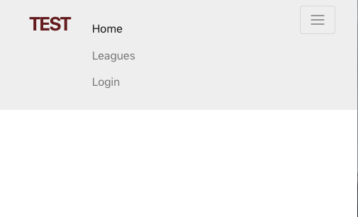
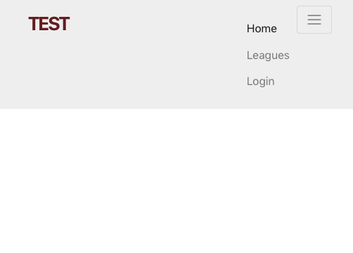
<nav class="navbar navbar-light navbar-fixed-top">
  <div class="container">

    <button type="button" class="navbar-toggler hidden-sm-up pull-xs-right"
            data-toggle="collapse" data-target=".nav-content">
              <span class="icon-bar"></span>
              <span class="icon-bar"></span>
              <span class="icon-bar"></span>
    </button>
    <a class="navbar-brand" href="#">Test</a>

    <div class="collapse navbar-toggleable-xs nav-content">
      <ul class="nav navbar-nav">
        <li class="nav-item">
          <a class="nav-link active" href="#">Home</a>
        </li>
        <li class="nav-item">
          <a class="nav-link" href="#">Leagues</a>
        </li>
        <li class="nav-item">
          <a class="nav-link" href="#">Login</a>
        </li>
      </ul>
    </div>
  </div>
</nav>
问题是,我希望菜单项(未折叠时)与右侧对齐,而当折叠时,则位于左侧,但在汉堡包按钮"和主导航下方.与BS 3兼容.
The Problem is, that I want to have the Menu Items (when not collapsed) aligned to the right and when collapsed, to the left side but below the Hamburger Button and the main nav. It worked fine with BS 3.
我已经用float-xs-right尝试过,但是它仍然不能正常工作.
I've tried it with float-xs-right, but the it still doesn't work properly.
亲切的问候, 克里斯
推荐答案
根据所使用的Bootstrap 4版本,语法已更改为float-**-right(请参见公用事业大修.
Depending on which version you're using of Bootstrap 4, the syntax has changed to float-**-right (See Responsive floats) as of the current v4.0.0-alpha.5, see this post under Utilities overhaul.
另一个问题是,当对navbar-toggler按钮使用自适应(浮动)实用程序时,列表项将出现在navbar-brand旁边,而不是在其下方.截至目前,我相信您必须自己解决此问题,方法是在崩溃的正确断点内清除浮点数.
Another issue is when using a Responsive (float) utility against the navbar-toggler button, the list items will appear next the the navbar-brand instead of below it. As of right now I believe you have to handle this yourself by clearing the float within the correct breakpoint for your collapse.
示例CSS:
@media (max-width: 574px) {
    .navbar-header:after,
    .navbar-header:before {
        display: table;
        content: " "
    }
    .navbar-header:after {
        clear: both
    }
}
工作示例:
@media (max-width: 574px) {
  .navbar-header:after,
  .navbar-header:before {
    display: table;
    content: " "
  }
  .navbar-header:after {
    clear: both
  }
}
<link rel="stylesheet" type="text/css" href="https://maxcdn.bootstrapcdn.com/bootstrap/4.0.0-alpha.5/css/bootstrap.min.css">

<nav class="navbar navbar-light navbar-fixed-top">
  <div class="container">

    <div class="navbar-header">
      <a class="navbar-brand" href="#">BRAND</a>

      <button class="navbar-toggler hidden-sm-up float-xs-right" type="button" data-toggle="collapse" data-target="#nav-content" aria-controls="nav-content" aria-expanded="false" aria-label="Toggle navigation"></button>
    </div>

    <div class="collapse navbar-toggleable-xs" id="nav-content">

      <ul class="nav navbar-nav float-sm-right">
        <li class="nav-item">
          <a class="nav-link" href="#">ABOUT</a>
        </li>
        <li class="nav-item">
          <a class="nav-link" href="#">BLOG</a>
        </li>
        <li class="nav-item">
          <a class="nav-link" href="#">LOGIN</a>
        </li>
        <li class="nav-item">
          <a class="nav-link" href="#">SIGN UP FREE</a>
        </li>
      </ul>
    </div>

  </div>
</nav>

<script src="https://cdnjs.cloudflare.com/ajax/libs/tether/1.4.0/js/tether.min.js"></script>
<script src="https://cdnjs.cloudflare.com/ajax/libs/jquery/3.1.1/jquery.min.js"></script>
<script src="https://maxcdn.bootstrapcdn.com/bootstrap/4.0.0-alpha.5/js/bootstrap.min.js"></script>
这篇关于Bootstrap V4可折叠Navbar对齐的文章就介绍到这了,希望我们推荐的答案对大家有所帮助,也希望大家多多支持IT屋!
