在发光的GIF中运行时,需要帮助改善它的GIF外观 [英] Need help improving this GIF appearance while it runs inside shiny
问题描述
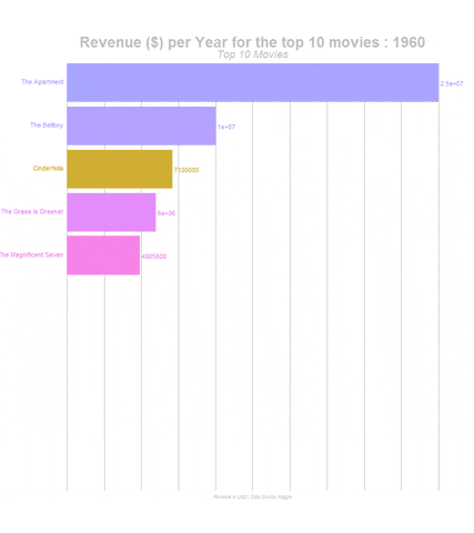
我正在尝试在闪亮的App中运行GIF.从技术上讲,我正在使用此代码生成GIF,并从我的计算机中将其手动上传到APP中.我的数据集的一部分如下所示,我要运行的是运行GIF,该图片显示了1960年至2015年的前10部电影.
I'm trying to run a GIF inside my shiny App. I'm technically using this code to generate a GIF and upload it manually from my computer inside the APP. Part of my dataset is shown below, what I'm trying to do is run a GIF that shows the top 10 movies from 1960 - 2015.
这是我GIF的链接. https://media.giphy.com/media/U4eSLRaDbGpjqU0V42/giphy.gif
this is the link to my GIF. https://media.giphy.com/media/U4eSLRaDbGpjqU0V42/giphy.gif
这是我的应用图片-( https://imgur.com/3Ddao5S ) 我需要解决4个问题.
This is my a picture of my App - (https://imgur.com/3Ddao5S) I need to address 4 problems.
1-首先,当我在光泽"选项卡上运行此电影时,其中的电影名称会被很好地剪切掉,因此您无法完全删除它们.如何确定其方向?
2-我希望最后显示的收入像1M或3M或300M而不是2554489,而且绝对不像1e + 554等 有没有办法像这样设置X轴?
2 - I want the revenue at the end shown like 1M or 3M or 300M NOT 2554489 and definitely NOT like 1e+ 554 etc Is there a way to set the X axis like that?
3-网格线很丑陋,如何删除它们?
4-放慢速度,怎么办?
是的,我知道我的应用程序没有直接渲染GIF,我花了数周的时间无法做到,而内部创建的GIF却无法正常工作.
Yes, I know my App is not directly rendering the GIF, I spent weeks couldn't do it GIF created inside just doesn't work.
ui <- fluidPage(theme = shinytheme("cerulean"),
                titlePanel(p(strong("Movie browser, 1960 - 2014", windowTitle = "Movies"))),

                # Sidebar layout with a input and output definitions
                sidebarLayout(
mainPanel(
                    tabsetPanel(
                     tabPanel(h4(p(strong("GIF"))), tags$img(src = "outfile.GIF"))
                  )
                )
)
structure(list(id = c(135397L, 135397L, 76341L, 76341L, 262500L,
140607L, 140607L, 140607L, 168259L, 168259L), budget = c(150000000L,
150000000L, 150000000L, 150000000L, 110000000L, 200000000L, 200000000L,
200000000L, 190000000L, 190000000L), revenue = c(1513528810,
1513528810, 378436354, 378436354, 295238201, 2068178225, 2068178225,
2068178225, 1506249360, 1506249360), title = structure(c(3L,
3L, 4L, 4L, 2L, 5L, 5L, 5L, 1L, 1L), .Label = c("Furious 7",
"Insurgent", "Jurassic World", "Mad Max: Fury Road", "Star Wars: The Force Awakens"
), class = "factor"), homepage = structure(c(2L, 2L, 3L, 3L,
5L, 4L, 4L, 4L, 1L, 1L), .Label = c("http://www.furious7.com/",
"http://www.jurassicworld.com/", "http://www.madmaxmovie.com/",
"http://www.starwars.com/films/star-wars-episode-vii", "http://www.thedivergentseries.movie/#insurgent"
), class = "factor"), director = structure(c(1L, 1L, 2L, 2L,
5L, 3L, 3L, 3L, 4L, 4L), .Label = c("Colin Trevorrow", "George Miller",
"J.J. Abrams", "James Wan", "Robert Schwentke"), class = "factor"),
    runtime = c(124L, 124L, 120L, 120L, 119L, 136L, 136L, 136L,
    137L, 137L), vote_average = c(6.5, 6.5, 7.1, 7.1, 6.3, 7.5,
    7.5, 7.5, 7.3, 7.3), release_year = c(2015L, 2015L, 2015L,
    2015L, 2015L, 2015L, 2015L, 2015L, 2015L, 2015L), genre = structure(c(1L,
    2L, 1L, 2L, 2L, 1L, 2L, 4L, 1L, 3L), .Label = c("Action",
    "Adventure", "Crime", "Fantasy"), class = "factor"), breakeven = c(1363528810,
    1363528810, 228436354, 228436354, 185238201, 1868178225,
    1868178225, 1868178225, 1316249360, 1316249360), AerageVotesCat = structure(c(2L,
    2L, 2L, 2L, 2L, 1L, 1L, 1L, 1L, 1L), .Label = c("Excellent",
    "Good"), class = "factor")), row.names = c(NA, 10L), class = "data.frame")
UI:
# library(gifski)
library(ggplot2)
library(gganimate)
library(dplyr)
library(scales)
library(shiny)


  output$plot2 <- renderImage({
    df2 <- df1 %>%
      group_by(release_year) %>%
      # The * 1 makes it possible to have non-integer ranks while sliding
      mutate(rank = rank(-revenue),
             Value_rel = revenue/revenue[rank==1],
             Value_lbl = paste0(" ",round(revenue))) %>%
      group_by(title) %>%
      filter(rank <=10) %>%
      ungroup()
    staticplot = ggplot(df2, aes(rank, group = title,
                                           fill = as.factor(title), color = as.factor(title))) +
      geom_tile(aes(y = revenue/2,
                    height = revenue,
                    width = 0.9), alpha = 0.8, color = NA) +
      geom_text(aes(y = 0, label = paste(title, " ")), vjust = 0.2, hjust = 1) +
      geom_text(aes(y=revenue,label = Value_lbl, hjust=0)) +
      coord_flip(clip = "off", expand = FALSE) +
      scale_y_continuous(labels = scales::comma) +
      scale_x_reverse() +
      guides(color = FALSE, fill = FALSE) +
      theme(axis.line=element_blank(),
            axis.text.x=element_blank(),
            axis.text.y=element_blank(),
            axis.ticks=element_blank(),
            axis.title.x=element_blank(),
            axis.title.y=element_blank(),
            legend.position="none",
            panel.background=element_blank(),
            panel.border=element_blank(),
            panel.grid.major=element_blank(),
            panel.grid.minor=element_blank(),
            panel.grid.major.x = element_line( size=.1, color="grey" ),
            panel.grid.minor.x = element_line( size=.1, color="grey" ),
            plot.title=element_text(size=25, hjust=0.5, face="bold", colour="grey", vjust=-1),
            plot.subtitle=element_text(size=18, hjust=0.5, face="italic", color="grey"),
            plot.caption =element_text(size=8, hjust=0.5, face="italic", color="grey"),
            plot.background=element_blank(),
            plot.margin = margin(2,2, 2, 4, "cm"))

    anim = staticplot + transition_states(release_year, transition_length = 4, state_length = 1) +
      view_follow(fixed_x = TRUE)  +
      labs(title = 'Revenue ($) per Year for the top 10 movies : {closest_state}',
           subtitle  =  "Top 10 Movies",
           caption  = "Revenue in USD | Data Source: Kaggle")
    anim_save("outfile.gif",animate(anim, 200, fps = 4,  width = 800, height = 900))
  })

    }
  )

}


# Create the Shiny app object
shinyApp(ui = ui, server = server)
推荐答案
我不知道您所有问题的答案,但请查看以下可自我维持的代码:
I do not know answers to all of your questions, but please have a look at the self-sustainable code below:
library(ggplot2)
library(reshape2)
library(scales)

example_df <- data.frame(movie=c("A", "B", "C", "D"),
                         revenue=c(3354823, 1284690, 8513581, 4699102))
x_cols <- scales::hue_pal()(length(levels(example_df$movie)))
names(x_cols) <- levels(example_df$movie)

ggplot(data=example_df) + geom_bar(aes(x=movie, y=revenue, fill=movie), stat="identity") +
  scale_y_continuous(labels = dollar_format(scale=10^-6, suffix="M")) +
  theme_bw() +
  theme(axis.text.x = element_text(angle=45,
                                   colour=x_cols[substr(levels(example_df$movie),1,1)]),
        panel.grid = element_blank())
我首先要说的是,您可能会使不使用geom_bar的事情变得过于复杂.它是专门为处理您要显示的数据而设计的.因此,坚持下去将是有利可图的.如果要使用与条形图本身相同的颜色为条形图的标签上色,可以按照此处显示的技巧进行操作:
I would start with the statement that you may be over-complicating things not using geom_bar. It was designed precisely to handle the kind of data you want to show. Thus it would be profitable to stick with it. If you want to colour the labels of a bar plot with the same colours as bars themselves you could follow the trick shown here: Color axis labels by group, which I shamelessly applied to my example.
广告. 1.
这是要复制的最棘手的部分,原因可能很多.避免这种情况的一种可靠方法是使用element_text函数的angle参数略微旋转名称.只要您重新使用条形图,此方法就可以使用.
Ad. 1.
This is the most tricky part to reproduce, and the reasons can be plenty. One sure way to circumvent that is to rotate names slightly, using angle parameter of the element_text function. This will work as long as you resort back to a bar plot.
广告. 2.
使用出色的scales库. dollar_format是您要查找的功能(尽管名称非常混乱).
Ad. 2.
Use the great scales library. dollar_format is the function you look for (although the name is pretty confusing).
广告. 3.
theme功能中的panel.grid.
Ad. 3.
panel.grid in the theme function.
这篇关于在发光的GIF中运行时,需要帮助改善它的GIF外观的文章就介绍到这了,希望我们推荐的答案对大家有所帮助,也希望大家多多支持IT屋!
