Bootstrap-为反向行模式创建移动适应 [英] Bootstrap - Creating mobile-adaptation for reverse row pattern
问题描述
我想用Bootstrap
创建相反的效果(第一行:左侧文本,右侧
第二行:左侧图像,右侧
第三行:左边的文字,右边的图像
第四行:左边的图像,右边的文本
I want to create a reverse effect with Bootstrap (1st row: Text on the left, image on the right 2nd row: Image on the left, text on the right 3rd row: Text on the left, image on the right 4th row: Image on the left, text on the right
然后它一直在继续!
在大型设备上看起来非常不错,但是当它在设备上显示时,它在逻辑上会适应,就好像图片一张接一张!
It's looking very nice on large devices but then when it shows on device, it logically adapts as if the pictures go one after another!
我希望在移动设备上始终显示:向上=文本,向下=图片,而不是变化形式。
I would like on mobile to always go : Up = Text, down = image instead of variations.
这是两行代码:
<!-- FIRST ROW -->
<div class="row border-marine margin-bottom">
<div class="col-lg-6 text-center">
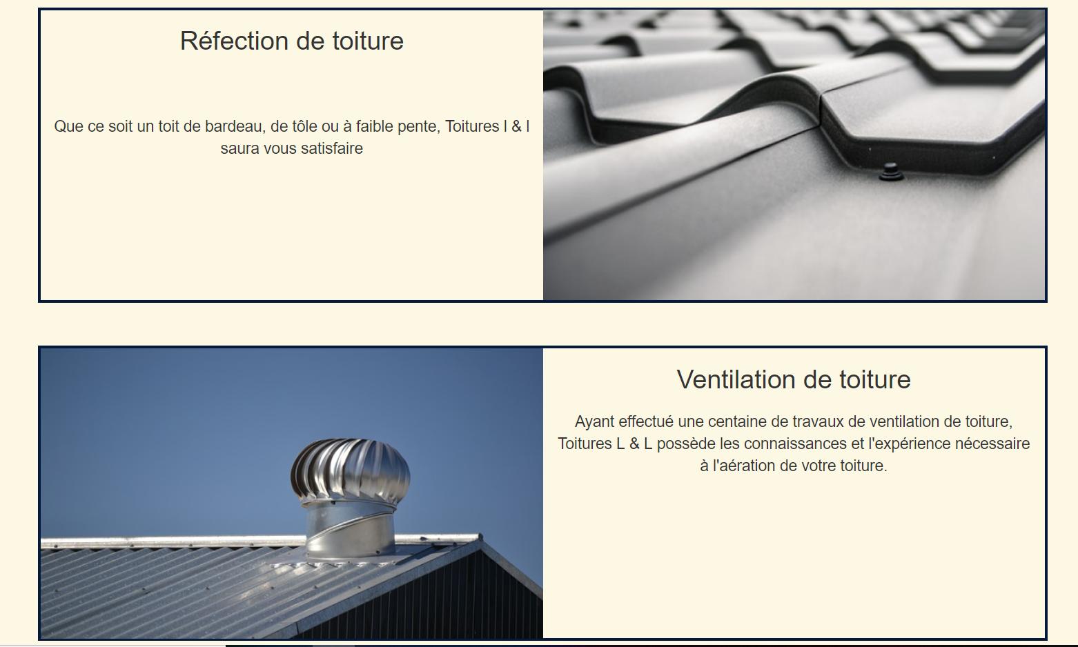
<h2 class="padding-bottom-large">Réfection de toiture</h2>
<p>Que ce soit un toit de bardeau, de tôle ou à faible pente, Toitures l & l saura
vous satisfaire</p>
</div>
<div id="no-padding" class="col-lg-6">
<img src="assets/img/toiture.png" class="img-responsive" alt="">
</div>
</div>
<!-- SECOND ROW -->
<div class="row border-marine margin-bottom">
<div id="no-padding" class="col-lg-6">
<img src="assets/img/ventilation.png" class="img-responsive" alt="">
</div>
<div class="col-lg-6 text-center">
<h2 class="padding-bottom-small">Ventilation de toiture</h2>
<p>Ayant effectué une centaine de travaux de ventilation de toiture, Toitures L & L
possède les connaissances et l'expérience nécessaire à l'aération de votre toiture.</p>
</div>
</div>
干杯!
推荐答案
假设您使用的是 Bootstrap 4 (Bootstrap的当前版本),您正在使用 flexbox 。这意味着您可以按照想要在DOM中的移动网站上显示内容的方式简单地进行布局(在HTML中的图像之前写出文本),然后使用 flex-direction:行反向 ,在桌面视图的左侧显示您希望图像显示的行。要真正了解,可以将其应用于 .row:n型(偶数) (或 odd )来反转第二行。
Assuming you are using Bootstrap 4 (which is the current version of Bootstrap), you're using flexbox under the hood. That means you can simply lay out the content in the way you would like it to appear for mobile sites in the DOM (writing out the text before the image in the HTML), and then make use of flex-direction: row-reverse for the rows that you wish to have the image appear on the left for desktop views. To get really fancy, you can apply this to .row:nth-of-type(even) (or odd) to invert every second row.
在下面可以看到:
.row:nth-of-type(even) {
  flex-direction: row-reverse;
}
<!-- BOOTSTRAP REFERENCES -->
<link rel="stylesheet" href="https://maxcdn.bootstrapcdn.com/bootstrap/4.0.0/css/bootstrap.min.css" integrity="sha384-Gn5384xqQ1aoWXA+058RXPxPg6fy4IWvTNh0E263XmFcJlSAwiGgFAW/dAiS6JXm" crossorigin="anonymous">
<script src="https://code.jquery.com/jquery-3.2.1.slim.min.js" integrity="sha384-KJ3o2DKtIkvYIK3UENzmM7KCkRr/rE9/Qpg6aAZGJwFDMVNA/GpGFF93hXpG5KkN" crossorigin="anonymous"></script>
<script src="https://cdnjs.cloudflare.com/ajax/libs/popper.js/1.12.9/umd/popper.min.js" integrity="sha384-ApNbgh9B+Y1QKtv3Rn7W3mgPxhU9K/ScQsAP7hUibX39j7fakFPskvXusvfa0b4Q" crossorigin="anonymous"></script>
<script src="https://maxcdn.bootstrapcdn.com/bootstrap/4.0.0/js/bootstrap.min.js" integrity="sha384-JZR6Spejh4U02d8jOt6vLEHfe/JQGiRRSQQxSfFWpi1MquVdAyjUar5+76PVCmYl" crossorigin="anonymous"></script>

<!-- FIRST ROW -->
<div class="row border-marine margin-bottom">
  <div class="col-lg-6 text-center">
    <h2 class="padding-bottom-large">Réfection de toiture</h2>
    <p>Que ce soit un toit de bardeau, de tôle ou à faible pente, Toitures l & l saura vous satisfaire</p>
  </div>
  <div class="col-lg-6">
    <img src="http://placehold.it/400" class="img-responsive" alt="">
  </div>
</div>

<!-- SECOND ROW -->
<div class="row border-marine margin-bottom">
  <div class="col-lg-6 text-center">
    <h2 class="padding-bottom-small">Ventilation de toiture</h2>
    <p>Ayant effectué une centaine de travaux de ventilation de toiture, Toitures L & L possède les connaissances et l'expérience nécessaire à l'aération de votre toiture.</p>
  </div>
  <div class="col-lg-6">
    <img src="http://placehold.it/400" class="img-responsive" alt="">
  </div>
</div>
NB:我已删除您的无保证金 ID,因为它们是重复的,重复的ID为 无效的标记 。在此演示中,我还用占位符替换了您的图像。
NB: I've removed your no-margin IDs, as these are duplicates, and duplicate IDs are not valid markup. I've also replaced your images with placeholders for the purposes of this demo.
Bootstrap 3.3不具有flexbox的便利性,因此,您必须 right 上,以使图像显示在左侧,选择器 .row:nth-of-type(even)> .col-lg-6:第一个类型。
Bootstrap 3.3 doesn't have the convenience of flexbox, so instead you'll have to float the columns. To achieve the same effect, what you'll want to do is float the first column (the content) to the right when you want the image displayed on the left, making use of the selector .row:nth-of-type(even) > .col-lg-6:first-of-type.
可以在下面看到:
.row:nth-of-type(even) > .col-lg-6:first-of-type {
  float: right;
}
<!-- BOOTSTRAP REFERENCES -->
<script src="https://ajax.googleapis.com/ajax/libs/jquery/2.1.1/jquery.min.js"></script>
<script src="https://maxcdn.bootstrapcdn.com/bootstrap/3.3.7/js/bootstrap.min.js"></script>
<link href="https://maxcdn.bootstrapcdn.com/bootstrap/3.3.7/css/bootstrap.min.css" rel="stylesheet"/>

<!-- FIRST ROW -->
<div class="row border-marine margin-bottom">
  <div class="col-lg-6 text-center">
    <h2 class="padding-bottom-large">Réfection de toiture</h2>
    <p>Que ce soit un toit de bardeau, de tôle ou à faible pente, Toitures l & l saura vous satisfaire</p>
  </div>
  <div class="col-lg-6">
    <img src="http://placehold.it/400" class="img-responsive" alt="">
  </div>
</div>

<!-- SECOND ROW -->
<div class="row border-marine margin-bottom">
  <div class="col-lg-6 text-center">
    <h2 class="padding-bottom-small">Ventilation de toiture</h2>
    <p>Ayant effectué une centaine de travaux de ventilation de toiture, Toitures L & L possède les connaissances et l'expérience nécessaire à l'aération de votre toiture.</p>
  </div>
  <div class="col-lg-6">
    <img src="http://placehold.it/400" class="img-responsive" alt="">
  </div>
</div>
这篇关于Bootstrap-为反向行模式创建移动适应的文章就介绍到这了,希望我们推荐的答案对大家有所帮助,也希望大家多多支持IT屋!
