CSS网格-2x2网格在可能的情况下始终占据整个宽度 [英] CSS Grid - 2x2 grid always taking up the full width when possible
问题描述
我正在尝试创建一个2x2 CSS网格(将来可能扩展到3x2),仅当网格中有三个孩子时才将项目推送到第一行,并且我不确定是否可以网格.
I'm trying to create a 2x2 CSS grid (possibly extended to 3x2 in the future) that only pushes items onto the first row when there are three children in the grid, and I'm not sure if this is possible with grid.
基于项目数量的方案将是:
The scenarios based on the number of items would be:
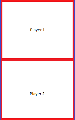
<div class="grid">
  <div class="player">Player 1</div>
  <div class="player">Player 2</div>
</div>
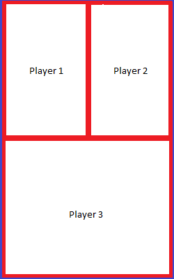
<div class="grid">
  <div class="player">Player 1</div>
  <div class="player">Player 2</div>
  <div class="player">Player 3</div>
</div>
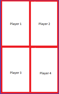
<div class="grid">
  <div class="player">Player 1</div>
  <div class="player">Player 2</div>
  <div class="player">Player 3</div>
  <div class="player">Player 4</div>
</div>
到目前为止,我已经尝试过以下操作:
So far what I've tried is the following:
.grid {
  height: 100%;
  display: grid;
  grid-template-columns: repeat(2, minmax(150px, 2fr));
  grid-template-rows: repeat(2, minmax(150px, 2fr));
  border: blue 5px solid;
}

.player {
  border: red 5px solid;
  display: flex;
  justify-content: center;
  align-items: center;
}
更改自动调整/自动填充的列数/行数也不会产生理想的结果,而是仅占用整个宽度.我已附上一个我在下面尝试过的示例:
Changing the number of columns/rows to autofit/autofill also does not produce the desired result, and instead simply takes up the full width regardless. I've attached a live example of what I've tried below:
https://codesandbox.io/s/misty-smoke-bwvtt
推荐答案
由于总共只有4个元素,因此您可以手动处理每种情况.在这种情况下,您只需要两个声明,而无需任何模板.隐式网格将为您完成这项工作.
Since it's only about 4 elements in total you can handle each case manually. In this situation, you only need two declarations without the need of any template. The implicit grid will do the job for you.
.grid {
  display: grid;
  height:300px;
  border: blue 5px solid;
}

.player {
  border: red 5px solid;
  display: flex;
  justify-content: center;
  align-items: center;
}

/* 3 players: make the last one take two colums*/
.player:nth-child(3):nth-last-child(1) {
    grid-column:span 2;
}

/* 4 players: make the second in the second column */
.player:nth-child(2):nth-last-child(3) {
    grid-column:2;
}
<div class="grid">
<div class="player">Player 1</div>
<div class="player">Player 2</div>
</div>
<div class="grid">
<div class="player">Player 1</div>
<div class="player">Player 2</div>
<div class="player">Player 3</div>
</div>
<div class="grid">
<div class="player">Player 1</div>
<div class="player">Player 2</div>
<div class="player">Player 3</div>
<div class="player">Player 4</div>
</div>对于3x2网格,您可以添加更多声明:
For a 3x2 grid you can add more declaration:
.grid {
  display: grid;
  height:300px;
  border: blue 5px solid;
}

.player {
  border: red 5px solid;
  display: flex;
  justify-content: center;
  align-items: center;
}

/* 3 players: make the last one take two colums*/
.player:nth-child(3):nth-last-child(1) {
    grid-column:span 2;
}

/* 4 players: make the second in the second column */
.player:nth-child(2):nth-last-child(3) {
    grid-column:2;
}

/* 5 players */
.player:nth-child(1):nth-last-child(5),
.player:nth-child(2):nth-last-child(4),
.player:nth-child(3):nth-last-child(3) {
  grid-column:span 2;
}

.player:nth-child(4):nth-last-child(2){
    grid-column:1/4;
}
.player:nth-child(5):nth-last-child(1){
    grid-column:4/7;
}

/* 6 players */
.player:nth-child(3):nth-last-child(4) {
    grid-column:3;
}
<div class="grid">
<div class="player">Player 1</div>
<div class="player">Player 2</div>
</div>
<div class="grid">
<div class="player">Player 1</div>
<div class="player">Player 2</div>
<div class="player">Player 3</div>
</div>
<div class="grid">
<div class="player">Player 1</div>
<div class="player">Player 2</div>
<div class="player">Player 3</div>
<div class="player">Player 4</div>
</div>
<div class="grid">
<div class="player">Player 1</div>
<div class="player">Player 2</div>
<div class="player">Player 3</div>
<div class="player">Player 4</div>
<div class="player">Player 5</div>
</div>
<div class="grid">
<div class="player">Player 1</div>
<div class="player">Player 2</div>
<div class="player">Player 3</div>
<div class="player">Player 4</div>
<div class="player">Player 5</div>
<div class="player">Player 6</div>
</div>这篇关于CSS网格-2x2网格在可能的情况下始终占据整个宽度的文章就介绍到这了,希望我们推荐的答案对大家有所帮助,也希望大家多多支持IT屋!
