如何在Chart.js中的Graph和X / Y-Scale之间添加填充? [英] How to add padding between Graph and X/Y-Scale in chart.js?
问题描述
我有一个简单的线条图使用chart.js。
它应该看起来像这样:
如果不适用,请删除scaleOverride和配置,并覆盖计算y轴刻度范围的常用方法,然后再初始化
  //这适用于所有使用此缩放的图表实例!
 var originalCalculateScaleRange = Chart.helpers.calculateScaleRange;
 Chart.helpers.calculateScaleRange = function(){
 var scaleRange = originalCalculateScaleRange.apply(this,arguments);
 //在顶部和底部添加1个单位
 scaleRange.min = scaleRange.min  -  scaleRange.stepValue;
 scaleRange.max = scaleRange.max + scaleRange.stepValue;
 scaleRange.steps = scaleRange.steps + 2;
 return scaleRange;
}
这将工作正常,假设你不介意额外的标签,都在0以上(我们的scaleLabel选项负责隐藏负面标签,只有负面标签)。
请注意,如果您使用其他图表
小提琴 - http://jsfiddle.net/mkzdzj3b/
I've got a simple Line-Chart using chart.js.
It should look something like this: http://fs1.directupload.net/images/150819/ktkgs9pw.jpg (Photoshop, I marked the paddings with red lines)
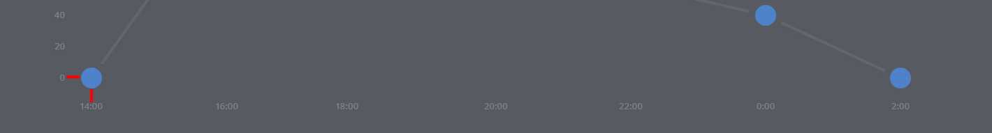
What it looks like at the moment with chart.js: http://fs2.directupload.net/images/150819/ql5l3jez.png
As you can see, the outline of the Graph-Points overlaps the X-Scale at the bottom, which is "2:00 PM" for example and the Y-Scale on the left, which is "0" for example.
My Line-Chart-Code:
HTML:
<canvas id="server-usage"></canvas>
Global Chartsettings:
Chart.defaults.global = {
            // Boolean - Whether to animate the chart
            animation: false,

            // Number - Number of animation steps
            animationSteps: 60,

            // String - Animation easing effect
            // Possible effects are:
            // [easeInOutQuart, linear, easeOutBounce, easeInBack, easeInOutQuad,
            //  easeOutQuart, easeOutQuad, easeInOutBounce, easeOutSine, easeInOutCubic,
            //  easeInExpo, easeInOutBack, easeInCirc, easeInOutElastic, easeOutBack,
            //  easeInQuad, easeInOutExpo, easeInQuart, easeOutQuint, easeInOutCirc,
            //  easeInSine, easeOutExpo, easeOutCirc, easeOutCubic, easeInQuint,
            //  easeInElastic, easeInOutSine, easeInOutQuint, easeInBounce,
            //  easeOutElastic, easeInCubic]
            animationEasing: "easeInOutQuart",

            // Boolean - If we should show the scale at all
            showScale: true,

            // Boolean - If we want to override with a hard coded scale
            scaleOverride: true,

            // ** Required if scaleOverride is true **
            // Number - The number of steps in a hard coded scale
            scaleSteps: 7,
            // Number - The value jump in the hard coded scale
            scaleStepWidth: 18,
            // Number - The scale starting value
            scaleStartValue: 0,

            // String - Colour of the scale line
            scaleLineColor: "#565a60",

            // Number - Pixel width of the scale line
            scaleLineWidth: 0.1,

            // Boolean - Whether to show labels on the scale
            scaleShowLabels: true,

            // Interpolated JS string - can access value
            scaleLabel: "<%=value%>",

            // Boolean - Whether the scale should stick to integers, not floats even if drawing space is there
            scaleIntegersOnly: true,

            // Boolean - Whether the scale should start at zero, or an order of magnitude down from the lowest value
            scaleBeginAtZero: false,

            // String - Scale label font declaration for the scale label
            scaleFontFamily: "'Open Sans', sans-serif",

            // Number - Scale label font size in pixels
            scaleFontSize: 13,

            // String - Scale label font weight style
            scaleFontStyle: "500",

            // String - Scale label font colour
            scaleFontColor: "#7c8189",

            // Boolean - whether or not the chart should be responsive and resize when the browser does.
            responsive: true,

            // Boolean - whether to maintain the starting aspect ratio or not when responsive, if set to false, will take up entire container
            maintainAspectRatio: false,

            // Boolean - Determines whether to draw tooltips on the canvas or not
            showTooltips: true,

            // Function - Determines whether to execute the customTooltips function instead of drawing the built in tooltips (See [Advanced - External Tooltips](#advanced-usage-custom-tooltips))
            customTooltips: false,

            // Array - Array of string names to attach tooltip events
            tooltipEvents: ["mousemove", "touchstart", "touchmove"],

            // String - Tooltip background colour
            tooltipFillColor: "#42454a",

            // String - Tooltip label font declaration for the scale label
            tooltipFontFamily: "'Open Sans', sans-serif",

            // Number - Tooltip label font size in pixels
            tooltipFontSize: 15,

            // String - Tooltip font weight style
            tooltipFontStyle: "normal",

            // String - Tooltip label font colour
            tooltipFontColor: "#e7e7e7",

            // String - Tooltip title font declaration for the scale label
            tooltipTitleFontFamily: "'Open Sans', sans-serif",

            // Number - Tooltip title font size in pixels
            tooltipTitleFontSize: 14,

            // String - Tooltip title font weight style
            tooltipTitleFontStyle: "regular",

            // String - Tooltip title font colour
            tooltipTitleFontColor: "#fff",

            // Number - pixel width of padding around tooltip text
            tooltipYPadding: 6,

            // Number - pixel width of padding around tooltip text
            tooltipXPadding: 6,

            // Number - Size of the caret on the tooltip
            tooltipCaretSize: 8,

            // Number - Pixel radius of the tooltip border
            tooltipCornerRadius: 0,

            // Number - Pixel offset from point x to tooltip edge
            tooltipXOffset: 10,

            // String - Template string for single tooltips
            tooltipTemplate: "On <%if (label){%><%=label%> there were <%}%><%= value %> active users",

            // String - Template string for multiple tooltips
            multiTooltipTemplate: "<%= value %>",

            // Function - Will fire on animation progression.
            onAnimationProgress: function(){},

            // Function - Will fire on animation completion.
            onAnimationComplete: function(){}
}
Some Chart-Data:
var usageData = {
     labels : ["2:00 PM","4:00 PM","6:00 PM","8:00 PM","10:00 PM","0:00 AM","2:00 AM"],
     datasets : [
         {
               strokeColor : "#61666c",
               pointColor : "#4e82c9",
               pointStrokeColor : "#565a60",
               data : [0,120,120,100,60,40,0]
          }
     ]
}
Chart-Options:
var options = {

            ///Boolean - Whether grid lines are shown across the chart
            scaleShowGridLines : false,

            //String - Colour of the grid lines
            scaleGridLineColor : "rgba(0,0,0,.05)",

            //Number - Width of the grid lines
            scaleGridLineWidth : 1,

            //Boolean - Whether to show horizontal lines (except X axis)
            scaleShowHorizontalLines: true,

            //Boolean - Whether to show vertical lines (except Y axis)
            scaleShowVerticalLines: true,

            //Boolean - Whether the line is curved between points
            bezierCurve : false,

            //Number - Tension of the bezier curve between points
            bezierCurveTension : 0.4,

            //Boolean - Whether to show a dot for each point
            pointDot : true,

            //Number - Radius of each point dot in pixels
            pointDotRadius : 18,

            //Number - Pixel width of point dot stroke
            pointDotStrokeWidth : 8,

            //Number - amount extra to add to the radius to cater for hit detection outside the drawn point
            pointHitDetectionRadius : 20,

            //Boolean - Whether to show a stroke for datasets
            datasetStroke : true,

            //Number - Pixel width of dataset stroke
            datasetStrokeWidth : 4,

            //Boolean - Whether to fill the dataset with a colour
            datasetFill : false,

            //String - A legend template
            legendTemplate : "<ul class=\"<%=name.toLowerCase()%>-legend\"><% for (var i=0; i<datasets.length; i++){%><li><span style=\"background-color:<%=datasets[i].strokeColor%>\"></span><%if(datasets[i].label){%><%=datasets[i].label%><%}%></li><%}%></ul>"

};
Creating the Chart:
var serverUsage = document.getElementById('server-usage').getContext('2d');
new Chart(serverUsage).Line(usageData, options);
I found a pretty similar question after searching for the Question-Tag chart.js, but it didn't work too good, since the solution is buggy when hovering and it's not a Line-Chart. (Chart.JS spacing and padding)
I hope I provided enough information and somebody can help me with that, since I really don't know anything about JavaScript. Thanks in advanced!
Actually you don't need all the complexity from the linked solution because
- You intend to not show the axes lines (I see from the image that you will set the chart background and the scale color to be the same) and
- You've already hardcoded the scale start and end values (by which I assume you know the range of values your data will be in and don't need it autocalculated) - see the alternative solution if this condition doesn't hold for you
With those caveats, you just need to make a few changes (just Ctrl + F on the option name to find the line to replace)
scaleSteps: 5,
// Number - The value jump in the hard coded scale
scaleStepWidth: 50,
// Number - The scale starting value
scaleStartValue: -50,
We're basically starting the scale to start from a value 1 step lower than what we need. This lifts up the graph. Now all we need to do is hide this extra scale label, which we do with
scaleLabel: function (d) {
    if (d.value < 0)
        return '';
    else
        return d.value + '         ';
},
The first line in the method takes care of hiding the extra scale label. The + ' ' on the last line moves the graph to the right (we tell Chart.js that the labels are longer than they really are)
Fiddle - http://jsfiddle.net/56578cn4/
If 2. doesn't apply, remove the scaleOverride and configuration and override the common method that calculates the y axis scale range before you initialize the chart to add one scale label above and one below
// this applies to all chart instances that use this scale!
var originalCalculateScaleRange = Chart.helpers.calculateScaleRange;
Chart.helpers.calculateScaleRange = function () {
    var scaleRange = originalCalculateScaleRange.apply(this, arguments);
    // add 1 unit at the top and bottom
    scaleRange.min = scaleRange.min - scaleRange.stepValue;
    scaleRange.max = scaleRange.max + scaleRange.stepValue;
    scaleRange.steps = scaleRange.steps + 2;
    return scaleRange;
}
This will work fine assuming you don't mind the extra labels when the values are all above 0 (our scaleLabel option takes care of hiding negative labels, and negative labels only).
Note that if you are using other charts where you don't want this to apply you'll need to revert this after you are done initializing your chart.
Fiddle - http://jsfiddle.net/mkzdzj3b/
这篇关于如何在Chart.js中的Graph和X / Y-Scale之间添加填充?的文章就介绍到这了,希望我们推荐的答案对大家有所帮助,也希望大家多多支持IT屋!
