移动Safari文本输入宽度错误? [英] Mobile Safari text input width bug?
问题描述
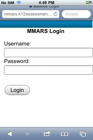
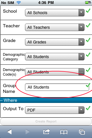
查看这些屏幕截图:
http:/ /i.stack.imgur.com/1TFuj.png
http://i.stack.imgur.com/3fukT.png
我在设置时无法获取文本输入到'width:100%'。文本框向右延伸得过长,在第一个屏幕截图中超过了正确的填充,在第二个屏幕截图中超过了div的右边距。
这是一个错误在移动Safari?如果是这样,任何人都可以建议解决方法?它似乎工作正常在其他移动浏览器和桌面版本的Safari。
感谢您提供任何帮助!
以下是第一张截图的代码:
 < div style = padding-left:1em; padding-right:1em;>
< div style =font-size:1.2em;>
用户名:
< / div>
< div>
< input type =textstyle =width:100%; font-size:1.1em; id =tbUsernamename =tbUsername>
< / div>
< / div>
下面是第二个的代码(注意select元素的样式是什么样子,are unafflicted):
 < div class =item>
< hr />
< div class =title>群组名称< / div>
< div class =content>
< asp:TextBox ID =tbGroupNamerunat =server>
< / asp:TextBox>
< / div>
< div class =confirmation>
< img alt =src =../ Graphics / Check-icon.pngrunat =serverid =imgConfirmGroupName/>
< / div>
< hr />
< / div>
这里是CSS:
pre>
 .item
 {

 padding-top:.5em;
 padding-bottom:.5em;
  border-left:1px solid black;
 border-bottom:1px solid black;

 padding-left:0.5em;
}
.item .title
{
float:left;
width:25%;
}
.item .content
{
float:left;
width:67%;
}
.item .confirmation
{
float:left;
width:8%;
}
.item .confirmation img
{
padding-left:.3em;
height:1.1em;
}
.item hr
{
clear:both;
visibility:hidden;
padding:0;
margin:0;
}
.item select
{
width:100%!important;
font-size:0.9em;
}
.item input
{
width:100%!important;
font-size:0.9em;
}
a href =https://developer.mozilla.org/En/CSS/Box-sizing>此属性对输入有帮助吗?
  input [type =text] {
 -moz-box-sizing:border-box;
 -webkit-box-sizing:border-box;
 box-sizing:border-box;
}
Take a look at these screenshots:
http://i.stack.imgur.com/1TFuj.png
http://i.stack.imgur.com/3fukT.png
I am having trouble getting text inputs to render as expected when set to 'width: 100%'. The text box extends too far to the right, past the right padding in the first screenshot and past the right margin of the div in the second screenshot.
Is this a bug in mobile Safari? If so, can anyone suggest a workaround? It seems to work fine in other mobile browsers and also in the desktop version of Safari. The problem seems limited to input elements, as select elements seem to have the proper width when styled in the exact same way.
Thanks in advance for any help!
Here's the code for the first screenshot:
<div style="padding-left: 1em; padding-right: 1em;">
    <div style="font-size: 1.2em;">
       Username:
    </div>
    <div>
        <input type="text" style="width: 100%; font-size: 1.1em;" id="tbUsername" name="tbUsername">
    </div>
</div>
And here's the code for the second (notice how the select elements, which are styled the exact same way, are unafflicted):
 <div class="item">
    <hr />
      <div class="title">Group Name</div>
      <div class="content">
         <asp:TextBox ID="tbGroupName" runat="server">
         </asp:TextBox>
      </div>
      <div class="confirmation">
         <img alt="" src="../Graphics/Check-icon.png" runat="server" id="imgConfirmGroupName"/>
     </div>
  <hr />
</div>
And here's the CSS:
.item
{

    padding-top: .5em;
    padding-bottom: .5em;border-left: 1px solid black;
border-bottom: 1px solid black;

padding-left: 0.5em;
}

.item .title
{
    float: left;
    width: 25%;
}

.item .content
{
    float: left;
    width: 67%;
}

.item .confirmation
{
    float:left;
    width: 8%;
}

.item .confirmation img
{
    padding-left: .3em;
    height: 1.1em;
}

.item hr
{
    clear: both;
    visibility: hidden;
    padding: 0;
    margin: 0;
}

.item select
{
    width: 100% !important;
    font-size: 0.9em;
}

.item input
{
    width: 100% !important;
    font-size: 0.9em;
}
Maybe this property on inputs will help you?
input[type="text"]{
   -moz-box-sizing:    border-box;
   -webkit-box-sizing: border-box;
    box-sizing:        border-box;
}
这篇关于移动Safari文本输入宽度错误?的文章就介绍到这了,希望我们推荐的答案对大家有所帮助,也希望大家多多支持IT屋!
