webkit中的奇怪的box-shadow artifacts [英] Weird box-shadow artifacts in webkit
问题描述
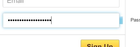
任何人都知道什么可能导致输入字段右侧的蓝色框?
这是我过去几天的祸害。仅间歇性显示。每个输入的标记如下:
 < div class =input text>
< label for =pass>密码< / label>
< input type =passwordname =passid =passclass =requiredtabindex =30/>
< / div>
需要注意的是,标签位于字段顶部,然后变暗/淡出
这仅适用于Mac上的webkit和显然是Vista。
http://i.stack.imgur.com/5BQcv.jpg
编辑:对不起,CSS:
  input [type =text],input [type =password] {
 height:30px;
 outline:none;
 -webkit-transition:-webkit-box-shadow 0.3s linear;
 -moz-transition:-moz-box-shadow 0.3s linear;
 transition:box-shadow 0.3s linear;
}

 .input.text input [type =text]:focus,input [type =text]:active,.input.text input [type =password ]:focus,input [type =password]:active {
 -moz-box-shadow:0 0 12px#82cce8;
 -webkit-box-shadow:0 0 12px#82cce8; / * chrome似乎显示一个较小的盒子阴影* /
 box-shadow:0 0 12px#82cce8;
}

 .input.text input,.input.text span.field {
 padding:10px 15px;
 width:92%;
 font-size:2em;
 font-family:'HelveticaNeueW01-45Ligh',Arial,Helvetica,sans-serif;
 border:1px solid #cecece;
 -webkit-border-radius:3px;
 -moz-border-radius:3px;
 border-radius:3px;
 -webkit-box-shadow:-2px -2px 3px rgba(205,205,205,0.3);
 -moz-box-shadow:-2px -2px 3px rgba(205,205,205,0.3);
 box-shadow:-2px -2px 3px rgba(205,205,205,0.3);
}
 input ::  -  webkit-input-placeholder {color:#e2e2e2;}
输入:-moz-placeholder {color:#e2e2e2;}
包含的div只有一个20像素的填充。
此外,sorry sdleihssirc
更新:通过gcpereira.com测试链接[无空格] / stuff / test / landing /
我无法在Safari 5.1(10.7)上复制,我知道你找到了一种替代策略, =http://tumble.sneak.co.nz/post/928998513/fixing-the-background-bleed =nofollow> - webkit-background-clip 出来,让我知道如果是有关。
-webkit-background-clip:padding-box;
希望它工作!
Anyone have any idea what could be causing the blue box to the right of the input field?
It's been the bane of my existence the past few days. Only appears intermittently. The markup for each input is like so:
<div class="input text">
    <label for="pass">Password</label>
    <input type="password" name="pass" id="pass" class="required"  tabindex="30"/>
</div>
Things to note are that the label is positioned on top of the field and then dimmed/faded out when clicked/typed on.
This only happens on webkit on Mac and apparently Vista.
http://i.stack.imgur.com/5BQcv.jpg
EDIT: Sorry, the CSS:
input[type="text"], input[type="password"] {
            height: 30px;
            outline: none;
            -webkit-transition: -webkit-box-shadow 0.3s linear;
            -moz-transition: -moz-box-shadow 0.3s linear;
            transition: box-shadow 0.3s linear;
        }

        .input.text input[type="text"]:focus, input[type="text"]:active, .input.text input[type="password"]:focus, input[type="password"]:active {
            -moz-box-shadow: 0 0 12px #82cce8;
            -webkit-box-shadow: 0 0 12px #82cce8; /* chrome seems to show a smaller box shadow */
            box-shadow: 0 0 12px #82cce8;
        }

        .input.text input, .input.text span.field {
            padding: 10px 15px;
            width: 92%;
            font-size: 2em;
            font-family: 'HelveticaNeueW01-45Ligh', Arial, Helvetica, sans-serif;
            border: 1px solid #cecece;
            -webkit-border-radius: 3px;
            -moz-border-radius: 3px;
            border-radius: 3px;
            -webkit-box-shadow: -2px -2px 3px rgba(205,205,205, 0.3);
            -moz-box-shadow: -2px -2px 3px rgba(205,205,205, 0.3);
            box-shadow: -2px -2px 3px rgba(205,205,205, 0.3);
        }
            input::-webkit-input-placeholder { color: #e2e2e2;}
            input:-moz-placeholder { color: #e2e2e2;}
The containing div just has a padding of 20px.
Also, sorry sdleihssirc, had to re-link image due to edit.
UPDATE: Test link over at gcpereira.com[no space]/stuff/test/landing/
I can't duplicate this on Safari 5.1 (10.7), and I know you've found an alternate tactic, but try -webkit-background-clip out and let me know if it is related.
-webkit-background-clip: padding-box;
Hope it works!
这篇关于webkit中的奇怪的box-shadow artifacts的文章就介绍到这了,希望我们推荐的答案对大家有所帮助,也希望大家多多支持IT屋!
