在Python/matplotlib中使用xaxis_date()手动设置xticks [英] Manually setting xticks with xaxis_date() in Python/matplotlib
问题描述
我一直在研究如何针对x轴上的时间绘制图并对其进行排序,一个奇怪的怪癖使我怀疑我是否遇到了bug或(很可能是)做一些我不太了解的事情.
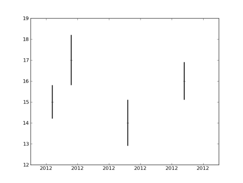
简单地说,下面是我的程序的简化版本.如果将其放在.py文件中并从解释器(ipython)执行,则会得到一个带有x轴的图形,其中仅带有年份"2012",重复了多次,
I've been looking into how to make plots against time on the x axis and have it pretty much sorted, with one strange quirk that makes me wonder whether I've run into a bug or (admittedly much more likely) am doing something I don't really understand.
Simply put, below is a simplified version of my program. If I put this in a .py file and execute it from an interpreter (ipython) I get a figure with an x axis with the year only, "2012", repeated a number of times, like this.
However, if I comment out the line (40) that sets the xticks manually, namely 'plt.xticks(tk)' and then run that exact command in the interpreter immediately after executing the script, it works great and my figure looks like this.
Similarly it also works if I just move that line to be after the savefig command in the script, that's to say to put it at the very end of the file. Of course in both cases only the figure drawn on screen will have the desired axis, and not the saved file. Why can't I set my x axis earlier?
Grateful for any insights, thanks in advance!
import matplotlib.pyplot as plt
import datetime

# define arrays for x, y and errors
x=[16.7,16.8,17.1,17.4]
y=[15,17,14,16]
e=[0.8,1.2,1.1,0.9]

xtn=[]

# convert x to datetime format
for t in x:
   hours=int(t)
   mins=int((t-int(t))*60)
   secs=int(((t-hours)*60-mins)*60)
   dt=datetime.datetime(2012,01,01,hours,mins,secs)
   xtn.append(date2num(dt))

# set up plot
fig=plt.figure()
ax=fig.add_subplot(1,1,1)

# plot
ax.errorbar(xtn,y,yerr=e,fmt='+',elinewidth=2,capsize=0,color='k',ecolor='k')

# set x axis range
ax.xaxis_date()
t0=date2num(datetime.datetime(2012,01,01,16,35)) # x axis startpoint
t1=date2num(datetime.datetime(2012,01,01,17,35)) # x axis endpoint
plt.xlim(t0,t1)

# manually set xtick values
tk=[]
tk.append(date2num(datetime.datetime(2012,01,01,16,40)))
tk.append(date2num(datetime.datetime(2012,01,01,16,50)))
tk.append(date2num(datetime.datetime(2012,01,01,17,00)))
tk.append(date2num(datetime.datetime(2012,01,01,17,10)))
tk.append(date2num(datetime.datetime(2012,01,01,17,20)))
tk.append(date2num(datetime.datetime(2012,01,01,17,30)))
plt.xticks(tk)

plt.show()

# save to file
plt.savefig('savefile.png')
I don't think you need that call to xaxis_date(); since you are already providing the x-axis data in a format that matplotlib knows how to deal with. I also think there's something slightly wrong with your secs formula.
We can make use of matplotlib's built-in formatters and locators to:
- set the major xticks to a regular interval (minutes, hours, days, etc.)
- customize the display using a strftime formatting string
It appears that if a formatter is not specified, the default is to display the year; which is what you were seeing.
Try this out:
import datetime as dt
import matplotlib.pyplot as plt
from matplotlib.dates import DateFormatter, MinuteLocator
x = [16.7,16.8,17.1,17.4]
y = [15,17,14,16]
e = [0.8,1.2,1.1,0.9]
xtn = []
for t in x:
h = int(t)
m = int((t-int(t))*60)
xtn.append(dt.datetime.combine(dt.date(2012,1,1), dt.time(h,m)))
def larger_alim( alim ):
''' simple utility function to expand axis limits a bit '''
amin,amax = alim
arng = amax-amin
nmin = amin - 0.1 * arng
nmax = amax + 0.1 * arng
return nmin,nmax
plt.errorbar(xtn,y,yerr=e,fmt='+',elinewidth=2,capsize=0,color='k',ecolor='k')
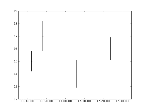
plt.gca().xaxis.set_major_locator( MinuteLocator(byminute=range(0,60,10)) )
plt.gca().xaxis.set_major_formatter( DateFormatter('%H:%M:%S') )
plt.gca().set_xlim( larger_alim( plt.gca().get_xlim() ) )
plt.show()
Result:
FWIW the utility function larger_alim was originally written for this other question: Is there a way to tell matplotlib to loosen the zoom on the plotted data?
这篇关于在Python/matplotlib中使用xaxis_date()手动设置xticks的文章就介绍到这了,希望我们推荐的答案对大家有所帮助,也希望大家多多支持IT屋!
