箱线图衡量数据集中数据的分布情况.它将数据集分为三个四分位数.该图表示数据集中的最小值,最大值,中值,第一四分位数和第三四分位数.通过绘制每个数据集的箱形图来比较数据集的数据分布也很有用.
使用 boxplot()在R中创建箱图.函数.
在R中创建箱图的基本语法是 :
boxplot(x,data,notch,varwidth,names,main)
以下是所用参数的说明及减号;
x 是一个向量或公式.
数据是数据框.
缺口是一个逻辑价值.设置为TRUE以绘制缺口.
varwidth 是一个逻辑值.设置为true以绘制与样本大小成比例的框的宽度.
名称是将在下面打印的组标签每个箱图.
main 用于给图表标题.
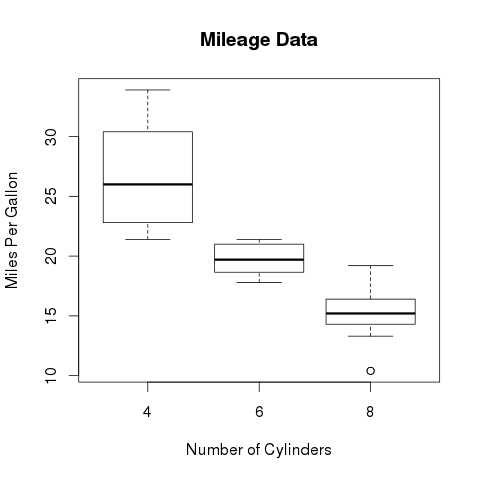
我们使用R环境中可用的数据集"mtcars"来创建基本的boxplot.让我们看看mtcars中的列"mpg"和"cyl".
input <- mtcars[,c('mpg','cyl')]
print(head(input))
当我们执行上面的代码时,它会产生以下结果 :
                   mpg  cyl
Mazda RX4         21.0   6
Mazda RX4 Wag     21.0   6
Datsun 710        22.8   4
Hornet 4 Drive    21.4   6
Hornet Sportabout 18.7   8
Valiant           18.1   6
以下脚本将为mpg(每加仑英里数)和cyl(气缸数)之间的关系创建一个箱线图.
# Give the chart file a name.
png(file = "boxplot.png")

# Plot the chart.
boxplot(mpg ~ cyl, data = mtcars, xlab = "Number of Cylinders",
   ylab = "Miles Per Gallon", main = "Mileage Data")

# Save the file.
dev.off()
当我们执行上面的代码时,它会产生以下结果:
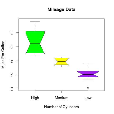
我们可以绘制带有凹槽的boxplot,以了解不同数据组的中位数如何相互匹配。
下面的脚本将为每个数据组创建一个带有凹槽的箱线图。
# Give the chart file a name.
png(file = "boxplot_with_notch.png")

# Plot the chart.
boxplot(mpg ~ cyl, data = mtcars,
   xlab = "Number of Cylinders",
   ylab = "Miles Per Gallon",
   main = "Mileage Data",
   notch = TRUE,
   varwidth = TRUE,
   col = c("green","yellow","purple"),
   names = c("High","Medium","Low")
)
# Save the file.
dev.off()
当我们执行上面的代码时,它会产生以下结果: