正文颜色显示在标题上方 [英] Body color appearing over header
问题描述
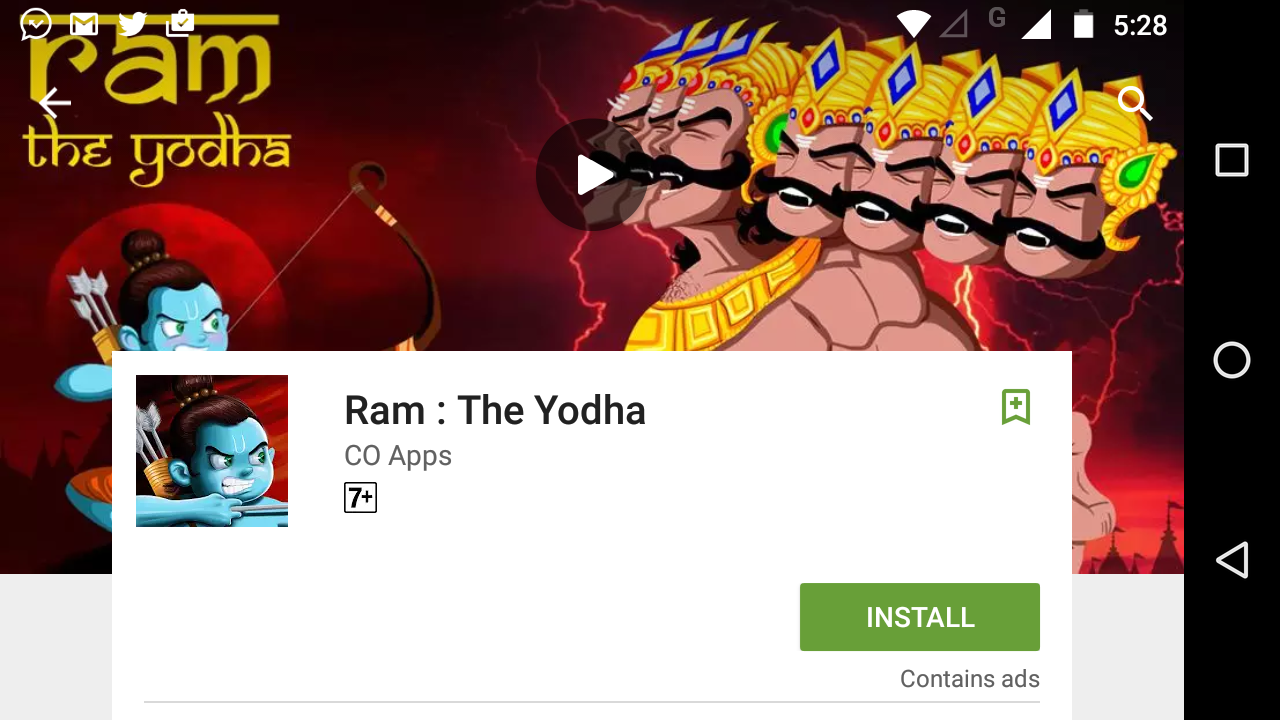
我正在尝试将Google Play设计为网页设计(移动版).我正在使用CUSTOM GRID SYSTEM(12 col 0.5%margin).问题是主体颜色出现在标题部分上(我认为是这样,也许是一个不同的问题).我想像这样使它看起来/滚动: Google Play移动版示例图片
I'm trying to design google play like webpage design (Mobile version). I'm using CUSTOM GRID SYSTEM (12 col 0.5% margin). The problem is that body color is appearing over header section (I think so, maybe its a different problem). I want to make it look/scroll like this: Example image of google play mobile
这是代码:
**
您可能需要放大至250%或横向最大宽度:640像素才能查看 设计.
You may need to zoom to 250% or landscape max width:640px to view the design.
**
body {
  margin: 0px;
  padding: 0px;
  font-family: Roboto;
  background: #eeeeee;
}
html {
  margin: 0px;
  padding: 0px;
}
h1 {
  font-size: 5.9vw;
}
h2 {
  font-size: 3.0vh;
}
p {
  font-size: 2vmin;
}
.top {
  height: auto;
  margin: auto;
  font-family: Roboto Light;
}
.nav {
  height: 40px;
  width: 100%;
  position: fixed;
  background: #4caf50;
  box-shadow: 0px 0px 6px 0px rgba(0, 0, 0, 0.5);
}
.nav a:link,
.nav a:visited {
  font-size: 20px;
  width: auto;
  padding: 5px;
  margin: 5px;
  text-decoration: none;
  color: white;
  text-align: center;
}
.nav a:hover,
.nav a:active {
  background-color: #388e38;
}
.header {
  background: url(https://amazingslider.com/wp-content/uploads/2012/12/dandelion.jpg) center center fixed;
  height: 70%;
  width: 100%;
}
a {
  text-decoration: none;
}
.container {
  margin: 5%;
  background: white;
}
.personal_icon {
  margin: 5%;
}
<html>
<head>
<title>
Test
</title>
<meta name="viewport" content="width=device-width, initial-scale=1.0">
<link rel="stylesheet" media="(max-width: 640px)" href="max-640px.css">
<link rel="stylesheet" media="(min-width: 640px)" href="min-640px.css">
<link rel="stylesheet" media="(orientation: landscape) and (max-width: 640px)" href="landscape.css">
<link rel="stylesheet" href="grid.css">
</head>
<body>
<div class="top">
<div class="nav">
<nav>
<img src="http://img.informer.com/icons/png/32/1531/1531696.png" style="height:40px; float:left;">
<a href="#" style="float:left; margin-top:0px; height:30px;">About Me</a>
<a href="#" style="float:left; margin-top:0px; height:30px;">My Projects</a>
</nav>
</div>
</div>
<br>
<div class="header">
</div>
<div class="container">
<div class="section group">
<div class="col span_2_of_12">
<div class="userinfo">
<img class="personal_icon" src="large.png" srcset="large.png 800w, medium.png 500w">
</div>
</div>
</div>
</div>
<div class="container">
<div class="section group">
<div class="col span_2_of_12">
<div class="userinfo">
<img class="personal_icon" src="large.png" srcset="large.png 800w, medium.png 500w">
</div>
</div>
</div>
</div>
<div class="container">
<div class="section group">
<div class="col span_2_of_12">
<div class="userinfo">
<img class="personal_icon" src="large.png" srcset="large.png 800w, medium.png 500w">
</div>
</div>
</div>
</div>
</body>
</html>
推荐答案
您想要这样的东西.在您的代码中,您正在修复标头的bg-image,因此主体将在该图像上滚动,因此需要修复标头而不是固定bg-image
You want something like this. In your code you are fixing bg-image of header, therefore the body will scroll over that image, so need to fix the header instead of fixing bg-image
body {
  margin: 0px;
  padding: 0px;
  font-family: Roboto;
  background: #eeeeee;
  padding-top:70vh;
}
html {
  margin: 0px;
  padding: 0px;
}
h1 {
  font-size: 5.9vw;
}
h2 {
  font-size: 3.0vh;
}
p {
  font-size: 2vmin;
}
.top {
  height: auto;
  margin: auto;
  font-family: Roboto Light;
}
.nav {
  height: 40px;
  width: 100%;
  position: fixed;
  background: #4caf50;
  box-shadow: 0px 0px 6px 0px rgba(0, 0, 0, 0.5);
  top:0;
}
.nav a:link,
.nav a:visited {
  font-size: 20px;
  width: auto;
  padding: 5px;
  margin: 5px;
  text-decoration: none;
  color: white;
  text-align: center;
}
.nav a:hover,
.nav a:active {
  background-color: #388e38;
}
.header {background: url(https://amazingslider.com/wp-content/uploads/2012/12/dandelion.jpg) center center fixed;
  height: 70vh;
  width: 100%;
  position:fixed;
  top:40px;
  z-index:-1;
}
a {
  text-decoration: none;
}
.container {
  margin: 5%;
  background: white;
}
.personal_icon {
  margin: 5%;
}
<html>
<head>
<title>
Test
</title>
<meta name="viewport" content="width=device-width, initial-scale=1.0">
<link rel="stylesheet" media="(max-width: 640px)" href="max-640px.css">
<link rel="stylesheet" media="(min-width: 640px)" href="min-640px.css">
<link rel="stylesheet" media="(orientation: landscape) and (max-width: 640px)" href="landscape.css">
<link rel="stylesheet" href="grid.css">
</head>
<body>
<div class="top">
<div class="nav">
<nav>
<img src="http://img.informer.com/icons/png/32/1531/1531696.png" style="height:40px; float:left;">
<a href="#" style="float:left; margin-top:0px; height:30px;">About Me</a>
<a href="#" style="float:left; margin-top:0px; height:30px;">My Projects</a>
</nav>
</div>
</div>
<br>
<div class="header">
</div>
<div class="container">
<div class="section group">
<div class="col span_2_of_12">
<div class="userinfo">
<img class="personal_icon" src="large.png" srcset="large.png 800w, medium.png 500w">
</div>
</div>
</div>
</div>
<div class="container">
<div class="section group">
<div class="col span_2_of_12">
<div class="userinfo">
<img class="personal_icon" src="large.png" srcset="large.png 800w, medium.png 500w">
</div>
</div>
</div>
</div>
<div class="container">
<div class="section group">
<div class="col span_2_of_12">
<div class="userinfo">
<img class="personal_icon" src="large.png" srcset="large.png 800w, medium.png 500w">
</div>
</div>
</div>
</div>
</body>
</html>
这篇关于正文颜色显示在标题上方的文章就介绍到这了,希望我们推荐的答案对大家有所帮助,也希望大家多多支持IT屋!
