可以对类别使用Highcharts散点图吗? [英] Possible to use Highcharts Scatter Plot with categories?
问题描述
Highcharts v3.01
Highcharts v3.01
我正在尝试使用散点图在命名类别中绘制点(这些类别实际上是数字,但是不连续,我不希望有间隔).
I'm trying to use a scatter plot to draw points within named categories (these are actually numeric, but out of series and I don't want gaps).
使用折线图类型是可行的,但我不希望这样做,因为我可能有数百个序列,并且散点更清晰.
Using line graph types would work, but I'd rather not as I have potentially hundreds of series and scatter points are clearer.
我最接近的是:
编辑-我会发布一个描述性图像,但是显然我需要信誉点.叹.
EDIT - I would post a descriptive image, but apparently I need reputation points. Sigh.
请在此处查看: http://i117.photobucket.com/albums/o63/Harry_Flashman/close_zpsfe6d3ea2.png
这是使用引用x和y的点
This is using points referencing an x and y,
data: [{x:108432,test:100,y:0}, {x:109802,test:100,y:51}, etc. ]
我想完全按照上面的步骤做,但是没有空白.
I want to do exactly as above, but without the gaps.
我可以看到拥有非线性无间隙轴的唯一方法是使用类别,这是我之前在其他线型图上使用的,但从未使用散点图.
The only way I can see to have a non-linear gap-free axis is with categories, which I've used before on other line-type graphs, but never with a Scatter Plot.
如果我将x轴类型"category"与类别数组一起使用,则它只会为每个类别分配一个分散值,其余的将分配给升序的数字类别(即,如果我使用点名称",则不会将它们分组选项).
If I use the x-axis type "category" with a category array instead, it only assigns one scatter value to each and the remainder to ascending numeric categories (i.e. it doesn't group them if I use the point "name" option).
xAxis: {
  type: category,
  categories: ['108432','109802','110240', etc. ]
}
具有如下所示的数据点:
with datapoints that look like this:
data: [{name:'108432',test:100,y:0}, {name:'109802',test:100,y:51}, etc. ]
这样结束.每个散点都有自己的类别.
Ends up like this. Each scatter point gets its own category.
http://i117.photobucket.com/albums/o63/Harry_Flashman/not_zps31aa4fef.png
任何帮助表示赞赏,如果我能使它工作的话,那就太好了.
Any help appreciated, this would be great if I could get it to work.
谢谢!
拍子
PS.在下面添加了整个图表脚本(减去大量数据).这是几乎可行"的版本.
PS. Added entire chart script (minus large amounts of data) below. This is the "almost works" version.
$('#container').highcharts({
  chart:    { type: 'scatter', zoomType: 'xy'     },
  title:    { text: 'Revision vs Runtime Scatter' },
  subtitle: { text: 'L3 Performance Test'         },
  xAxis:    {
    title:      { enabled: true, text: 'Revision' },
    startOnTick:   true,
    endOnTick:     true,
    showLastLabel: true,
    showEmpty:     false,
    legend:      { y: 120, floating: true, backgroundColor: '#FFFFFF' },
    labels:      { rotation: -90, align: 'right' },
    categories:  ['101831','101849','101850','101857','101861','101866','101868','101878','101879','101880','101881','101882','101883','101884','101885','101888','101894','101900','101903','101905','101908','101913','101914']
  },
  yAxis:       { title: { text: 'Variance (%)' } },
  legend:      { layout: 'vertical' },
  plotOptions: {
    scatter: {
      marker: { radius: 5, states: { hover: { enabled: true, lineColor: 'rgb(100,100,100)' } } },
        states: { hover: { marker: { enabled: false } } },
        tooltip: {
          headerFormat: '<b></b>',
          pointFormat: '<b>Test {point.test}</b><br/>r{point.x}<br/>{point.y}% change<br/>{series.name}'
        }
      }
    },
    series: [{
      name: 'PRd',
      data: [{x:101857,test:267,y:0}, {x:101861,test:267,y:-1}, {x:101866,test:267,y:-0}, {x:101868,test:267,y:-1}, {x:101878,test:267,y:-1}, {x:101879,test:267,y:-1}, {x:101880,test:267,y:-0}, {x:101881,test:267,y:-0}, {x:101882,test:267,y:-0}, {x:101883,test:267,y:-0}, {x:101884,test:267,y:-0}, {x:101885,test:267,y:-0}, {x:101888,test:267,y:-0}, {x:101894,test:267,y:-1}, {x:101900,test:267,y:-0}, {x:101903,test:267,y:-0}, {x:101905,test:267,y:-1}, {x:101908,test:267,y:-1}, {x:101913,test:267,y:0}, {x:101914,test:267,y:1}, {x:101831,test:430,y:0}, {x:101849,test:430,y:1}, {x:101850,test:430,y:1}]
      }, {
      name: 'Non-PRd',
      data: [{x:101831,test:100,y:0}, {x:101849,test:100,y:51}, {x:101850,test:100,y:51}, {x:101857,test:100,y:52}, {x:101861,test:100,y:49}, {x:101866,test:100,y:50}, {x:101868,test:100,y:50}, {x:101878,test:100,y:50}, {x:101879,test:100,y:50}, {x:101880,test:100,y:50}, {x:101881,test:100,y:50}, {x:101882,test:100,y:50}, {x:101883,test:100,y:50}, {x:101884,test:100,y:50}, {x:101885,test:100,y:50}, {x:101888,test:100,y:50}, {x:101894,test:100,y:50}, {x:101900,test:100,y:50}, {x:101903,test:100,y:0}, {x:101905,test:100,y:50}, {x:101908,test:100,y:51}, {x:101913,test:100,y:50}, {x:101914,test:100,y:50}, {x:101831,test:10937,y:0}, {x:101849,test:10937,y:2}]
    }]
  });
});
推荐答案
好的,通过一种解决方法对其进行了修复,
Ok, fixed it via a workaround,
从本质上讲,我在点数组中添加了一个位置,该位置与该点所属的类别有关(通过PHP生成,类别按升序排列).相关位如下:
Essentially in Javascript I've added a position to the point arrays relating to which of the categories the point belongs to (generated via PHP, the categories are sorted ascending). Relevant bits are as follows:
xAxis:    {
  categories: ['r101831', 'r101849', 'r101850']
}

plotOptions: {
  tooltip: {
    headerFormat: '<b></b>',
    pointFormat: '
      <b>Test {point.test}</b><br/>
      r{point.revision}<br/>
      {point.y}% change<br/>
      {series.name}'
  }
}

series: [{
  name: 'PRd',
  data: [
  {x:3,revision:101831,test:267,y:0},
  {x:4,revision:101849,test:267,y:-1},
  {x:5,revision:101850,test:267,y:-0}
  ]}
]
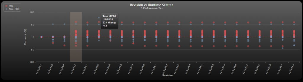
最终结果看起来不错,我喜欢HighCharts.
End result looks gorgeous, I love HighCharts.
此处的图片: http://i117.photobucket.com/albums/o63/Harry_Flashman/fixed_zps9952d58d.png
这篇关于可以对类别使用Highcharts散点图吗?的文章就介绍到这了,希望我们推荐的答案对大家有所帮助,也希望大家多多支持IT屋!
