Chrome下滚动条的奇怪Z索引行为 [英] Strange z-index behavior with scrollbars under Chrome
问题描述
在固定"定位的元素上使用z-index CSS属性给我一个奇怪的行为,在Chrome下.
Using z-index CSS property on 'fixed' positioned elements gives me a strange behavior under Chrome.
当Firefox和Opera浏览器给我期待的结果时,Chrome似乎不尊重z-index属性,将滚动条显示在红色叠加层上方(请参见代码和Fiddle波纹管).
When Firefox and Opera browsers give me the awaited result, Chrome does not seem to respect the z-index property, displaying the scrollbar above the red overlay (see code and Fiddle bellow).
HTML:
<div class="left">
    <div class="placeholder"></div>
</div>
<div class="right"></div>
<div class="overlay"></div>
CSS:
.left {
    background-color: yellow;
    bottom: 0;
    left: 0;
    overflow: auto;
    position: fixed;
    top: 0;
    width: 35%;
    z-index: 10;
}

.right {
    background-color: orange;
    bottom: 0;
    position: fixed;
    right: 0;
    top: 0;
    width: 65%;
    z-index: 20;
}

.overlay {
    background-color: red;
    bottom: 20%;
    left: 25%;
    position: fixed;
    right: 25%;
    top: 20%;
    z-index: 40;
}

.placeholder {
    height: 3000px;
}
示例: http://jsfiddle.net/kvNFW/
操作系统:Apple Mac OS 10.8 谷歌浏览器:版本27.0.1453.93
OS: Apple Mac OS 10.8 Google Chrome: Version 27.0.1453.93
有人遇到过同样的问题,或者有办法解决吗?
Is there someone having experienced the same issues, or having a way to fix that?
在此先感谢您的帮助.
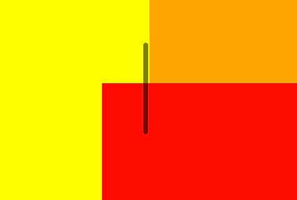
有关此问题的概述,请参见此屏幕快照.
See this screenshot for an overview of the issue.
推荐答案
您可以尝试添加-webkit-transform: translate3d(0, 0, 0).它解决了我在移动Chrome中遇到的类似问题.
You may try to add -webkit-transform: translate3d(0, 0, 0). It solves my similar problem happened in mobile chrome.
这篇关于Chrome下滚动条的奇怪Z索引行为的文章就介绍到这了,希望我们推荐的答案对大家有所帮助,也希望大家多多支持IT屋!
