Flutter-如何制作具有固定高度的自定义圆形选项卡指示器? [英] Flutter - How to make custom rounded shape tab indicator with fixed height?
本文介绍了Flutter-如何制作具有固定高度的自定义圆形选项卡指示器?的处理方法,对大家解决问题具有一定的参考价值,需要的朋友们下面随着小编来一起学习吧!
问题描述
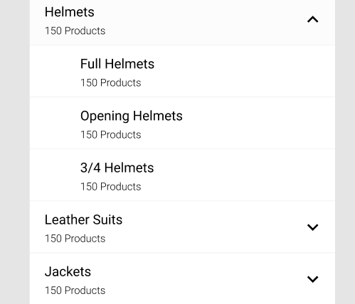
我想制作一个圆形的指示器,如下图所示.
I want to make an indicator with a rounded shape like the below image.
我为此做了很多尝试,但是我无法使其形状像设计一样.
I tried a lot for it but I can't make it a shape like a design.
并且还告诉我如何使颤动的部分可扩展listview吗? 为列表视图设计
And also tell me how to make sectional expandable listview with flutter? Design for listview
推荐答案
具有圆形形状的自定义指标
您可以使用CustomPainer
Custom indicator with a rounded shape
You can use the CustomPainer
  final Paint paint = Paint();
paint.color =  Color(0xff1967d2);
paint.style = PaintingStyle.fill;
canvas.drawRRect(
    RRect.fromRectAndCorners(rect,
        topRight: Radius.circular(8), topLeft: Radius.circular(8)),
    paint);
在此处中观看现场演示.
完成下面给出的示例代码.
Complete sample code given below.
  import 'package:flutter/material.dart';

final Color darkBlue = Color.fromARGB(255, 18, 32, 47);

void main() {
  runApp(MyApp());
}

class MyApp extends StatelessWidget {
  @override
  Widget build(BuildContext context) {
    return MaterialApp(
      theme: ThemeData.dark().copyWith(scaffoldBackgroundColor: darkBlue),
      debugShowCheckedModeBanner: false,
      home: DefaultTabController(
      length: 4,
      child: Scaffold(
        appBar: AppBar(
          centerTitle: true,
          title: Text("Demo page", style: TextStyle(
            color: Colors.black87
          ),),
          backgroundColor: Colors.white,
          bottom: TabBar(
            labelStyle: TextStyle(
              fontWeight: FontWeight.w700
            ),
            indicatorSize: TabBarIndicatorSize.label,
            labelColor: Color(0xff1967d2),
            unselectedLabelColor: Color(0xff5f6368),
            isScrollable: true,
            indicator: MD2Indicator(
              indicatorSize: MD2IndicatorSize.full,
              indicatorHeight: 8.0,
              indicatorColor: Colors.green,
            ),
            tabs: <Widget>[
              Tab(
                text: "Home",
              ),
              Tab(
                text: "Personal info",
              ),
              Tab(
                text: "Data & personalization",
              ),
              Tab(
                text: "Security",
              )
            ],
          ),
        ),
      )
      ,
    ),
    );
  }
}


enum MD2IndicatorSize {
  tiny,
  normal,
  full,
}

class MD2Indicator extends Decoration {
  final double indicatorHeight;
  final Color indicatorColor;
  final MD2IndicatorSize indicatorSize;

  const MD2Indicator(
      {@required this.indicatorHeight,
      @required this.indicatorColor,
      @required this.indicatorSize});

  @override
  _MD2Painter createBoxPainter([VoidCallback onChanged]) {
    return new _MD2Painter(this, onChanged);
  }
}

class _MD2Painter extends BoxPainter {
  final MD2Indicator decoration;

  _MD2Painter(this.decoration, VoidCallback onChanged)
      : assert(decoration != null),
        super(onChanged);

  @override
  void paint(Canvas canvas, Offset offset, ImageConfiguration configuration) {
    assert(configuration != null);
    assert(configuration.size != null);

    Rect rect;
    if (decoration.indicatorSize == MD2IndicatorSize.full) {
      rect = Offset(offset.dx,
              (configuration.size.height - decoration.indicatorHeight ?? 3)) &
          Size(configuration.size.width, decoration.indicatorHeight ?? 3);
    } else if (decoration.indicatorSize == MD2IndicatorSize.normal) {
      rect = Offset(offset.dx + 6,
              (configuration.size.height - decoration.indicatorHeight ?? 3)) &
          Size(configuration.size.width - 12, decoration.indicatorHeight ?? 3);
    } else if (decoration.indicatorSize == MD2IndicatorSize.tiny) {
      rect = Offset(offset.dx + configuration.size.width / 2 - 8,
              (configuration.size.height - decoration.indicatorHeight ?? 3)) &
          Size(16, decoration.indicatorHeight ?? 3);
    }

    final Paint paint = Paint();
    paint.color = decoration.indicatorColor ?? Color(0xff1967d2);
    paint.style = PaintingStyle.fill;
    canvas.drawRRect(
        RRect.fromRectAndCorners(rect,
            topRight: Radius.circular(8), topLeft: Radius.circular(8)),
        paint);
  }
}
以上摘录自此软件包
https://pub.dev/packages/md2_tab_indicator
这篇关于Flutter-如何制作具有固定高度的自定义圆形选项卡指示器?的文章就介绍到这了,希望我们推荐的答案对大家有所帮助,也希望大家多多支持IT屋!
查看全文
