Highcharts进度条形图 [英] Highcharts Progress Bar Chart
问题描述
是否可以像这样在Highcharts中创建一个进度表:
https://0.s3.envato.com/files/84221450/screenshots/weblator_responsive_charts_7_bootstrap.jpg
我相信可以定制条形图来创建这个。但是,是否可以改变样式,以便不显示任何轴,并且条形标签位于条形上方而不是在它们之前?
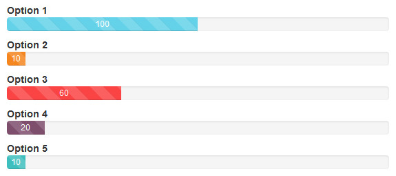
可能重新创建,但它不是很动态(风格)。因此,您必须根据图表中的数据系列调整 css 。
$ b
< script src =https://code.highcharts.com/highcharts.js>< / script>< script src =https://code.highcharts.com/modules/exporting.js>< / script>< div id =containerstyle =min-width:310px; height:400px; margin:0 auto >< / div>
Is it possible to create a progress chart in Highcharts like this:
https://0.s3.envato.com/files/84221450/screenshots/weblator_responsive_charts_7_bootstrap.jpg
I believe a bar chart can be customized to create this. But is it possible to change the styling so that no axes are showing and the bar labels are positioned above the bars rather than preceding them?
Possible to recreate but it is not so dynamic( in style ). So you have to adjust css according to data series in chart.
var chart = new Highcharts.Chart({
  chart: {
    renderTo: 'container',
    type: 'bar',

    marginBottom: 120
  },
  legend: {
    enabled: false
  },
  colors: ['#173c64'],
  xAxis: {
    categories: ['option 1', 'option 2', 'option 3', 'option 4 ', 'option 5 '],
    labels: {
      align: 'left',
      x: 5,
      y: -20, /* to be adjusted according to number of bars*/
      style: {
       fontSize: "1rem",
        color: '#000'
      }
    },
    lineWidth: 0,
    gridLineWidth: 0,
    lineColor: 'transparent',
    minorTickLength: 0,
    tickLength: 0,
    title: {
      enabled: false
    }

  },
  yAxis: {
    lineWidth: 0,
    gridLineWidth: 0,
    lineColor: 'transparent',
    labels: {
      enabled: false
    },
    minorTickLength: 0,
    tickLength: 0,
    title: {
      enabled: false
    }
  },
  plotOptions: {
    bar: {
      stacking: "normal",
      //groupPadding: 0, //add here
      //pointPadding: 0, //add here,
      dataLabels: {
        enabled: true,
        color: (Highcharts.theme && Highcharts.theme.dataLabelsColor) || 'white'
      }
    }
  },
  title: {
    margin: 0,
    useHTML: true,
    text: "Test",
    style: {
      "color": "#333333",
      "fontSize": "1.5rem",
      "fontWeight": "bold"
    }
  },

  series: [{
    data: [{
      y: 100,
      color: '#99ddff'
    }, {
      y: 10,
      color: '#ff8c1a'
    }, {
      y: 20,
      color: '#ff471a'
    }, {
      y: 60,
      color: '#c299ff'
    }, {
      y: 10,
      color: '#99ddff'
    }]
  }]
})
<script src="https://code.highcharts.com/highcharts.js"></script>
<script src="https://code.highcharts.com/modules/exporting.js"></script>

<div id="container" style="min-width: 310px; height: 400px; margin: 0 auto"></div>
这篇关于Highcharts进度条形图的文章就介绍到这了,希望我们推荐的答案对大家有所帮助,也希望大家多多支持IT屋!
