空间均匀(证明内容)不适用于Chrome移动 [英] space-evenly (justify-content) not working on Chrome mobile
问题描述
我在Chrome移动设备上为 justify-content 设置了空间均匀值问题(它工作正常在桌面和Firefox手机上)。
我设法产生了一个最简单的例子:示例
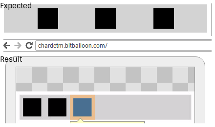
我在行方向上有一个flex容器,我希望元素能够按照预期均匀间隔使用空间的均匀。它适用于台式机,但是在Chrome移动版(Android版59)上,元素左对齐。以下是两者的比较:比较
center 和 space-around values按预期工作,但是我真的很想使用 space-uniformity 或其他等价物( flex-wrap:wrap 行为对我来说也很重要)。
这是我的HTML:
 < div class =container>
< div class =element>< / div>
< div class =element>< / div>
< div class =element>< / div>
< / div>
以下是我的CSS:
  .container {
 display:flex;
 flex-direction:row;
 justify-content:space-uniformity;
 flex-wrap:wrap;
背景:lightgrey;
}

 .element {
 margin:8px;
 width:42px;
 height:42px;
背景:黑色;
}
感谢您!
对于不支持它的浏览器,多线/包装空间均匀还没有解决方案。 / p>
当使用 flex-wrap:wrap 时,您将需要在flex容器上设置固定填充,这些项目或使用一个脚本。
如果可以包装每行,您可以使用伪元素与空格以获得与空格均匀给出完全相同的结果。
在下面的示例中, code> space-between 会在计算空格之间的空格时考虑零宽度伪元素,因此会产生相同的结果。
.container {显示:flex; flex-direction:row; justify-content:space-between; / * flex-wrap:wrap; * / / * align-items:flex-start;如果img,这将防止它延伸* / background:lightgrey;}。element {margin:8px;宽度:42px;身高:42px; background:black;}。container :: before,.container :: after {content:';}
< div class =container> < div class =element>< / div> < div class =element>< / div> < div class =element>< / div>< / div>
I have an issue with the space-evenly value for justify-content on Chrome mobile (it works fine on Desktop and on Firefox mobile).
I managed to produce a minimal example: Example
I have a flex container in a row direction and I want the elements to be spaced evenly, as intended when using space-evenly. It works on desktop, but on Chrome mobile (version 59 on Android), however, the elements are aligned on the left. Here is a comparison of the two: Comparison
center and space-around values work as intended, however, but I really want to use space-evenly or an equivalent (the flex-wrap: wrap behavior is also important to me).
Here is my HTML:
<div class="container">
  <div class="element"></div>
  <div class="element"></div>
  <div class="element"></div>
</div>
And here is my CSS:
.container {
  display: flex;
  flex-direction: row;
  justify-content: space-evenly;
  flex-wrap: wrap;
  background: lightgrey;
}

.element {
  margin: 8px;
  width: 42px;
  height: 42px;
  background: black;
}
Thanks in advance!
There is no solution yet for multi-line/wrapped space-evenly for browsers that doesn't support it.
When using flex-wrap: wrap you will need to i.e. set a fixed padding on the flex container, margin on the items or use a script.
If it is possible to wrap each row you can use the pseudo elements in combination with space-between to achieve the exact same result as space-evenly give.
In below sample the space-between will take the zero width pseudo elements into account when calculating the space between, hence producing the same result.
.container {
  display: flex;
  flex-direction: row;
  justify-content: space-between;
  /* flex-wrap: wrap; */
  /* align-items: flex-start;        if "img", this will prevent it from stretching  */
  background: lightgrey;
}

.element {
  margin: 8px;
  width: 42px;
  height: 42px;
  background: black;
}

.container::before,
.container::after {
  content: '';
}
<div class="container">
  <div class="element"></div>
  <div class="element"></div>
  <div class="element"></div>
</div>
这篇关于空间均匀(证明内容)不适用于Chrome移动的文章就介绍到这了,希望我们推荐的答案对大家有所帮助,也希望大家多多支持IT屋!
