通常,如果容器的空间不足,其余的flex项将被隐藏,如下所示.
flex-wrap 属性用于指定flex-container是单行还是多行的控件.
用法 :
flex-wrap: nowrap | wrap | wrap-reverse
flex-direction: column | column-reverse
此属性接受以下值 :
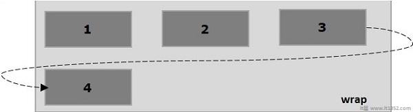
wrap : 如果空间不足,容器的元件(flexitems)将从上到下包裹成额外的柔性线.
包装 - 反转 : 如果空间不足,容器的元件(flex-items)将从底部到顶部包裹成额外的柔性线.
现在,我们将看到如何使用 wrap 属性和示例.
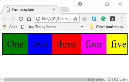
传递值换行到属性 flex-wrap ,容器的元素从左到右水平排列,如下所示.
以下示例演示了将值 wrap 传递给
<!doctype html>
<html lang = "en">
   <style>
      .box1{background:green;}
      .box2{background:blue;}
      .box3{background:red;}
      .box4{background:magenta;}
      .box5{background:yellow;}
      .box6{background:pink;}

      .box{
         font-size:35px;
         padding:15px;
         width:100px;
      }
      .container{
         display:flex;
         border:3px solid black;
         flex-direction:row;
         flex-wrap:wrap;
      }
   </style>

   <body>
      <div class = "container">
         <div class = "box box1">One</div>
         <div class = "box box2">two</div>
         <div class = "box box3">three</div>
         <div class = "box box4">four</div>
         <div class = "box box5">five</div>
         <div class = "box box6">six</div>
      </div>
   </body>
</html>
它将产生以下结果 :
在将值wrap-reverse传递给属性flex-wrap时,容器的元素从左到右水平排列,如下所示。
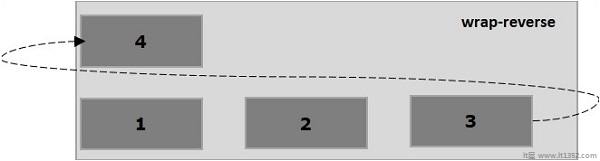
以下示例演示将值wrap-reverse传递给flex-wrap属性的结果。 在这里,我们使用flex-direction值行创建六个具有不同颜色的框。
<!doctype html>
<html lang = "en">
   <style>
      .box1{background:green;}
      .box2{background:blue;}
      .box3{background:red;}
      .box4{background:magenta;}
      .box5{background:yellow;}
      .box6{background:pink;}

      .box{
         font-size:35px;
         padding:15px;
         width:100px;
      }
      .container{
         display:flex;
         border:3px solid black;
         flex-direction:row;
         flex-wrap:wrap-reverse;
      }
   </style>
   <body>
      <div class = "container">
         <div class = "box box1">One</div>
         <div class = "box box2">two</div>
         <div class = "box box3">three</div>
         <div class = "box box4">four</div>
         <div class = "box box5">five</div>
         <div class = "box box6">six</div>
      </div>
   </body>
</html>在将值包装传递给属性flex-wrap并将值列传递给属性flex-direction时,容器的元素从左到右水平排列,如下所示。
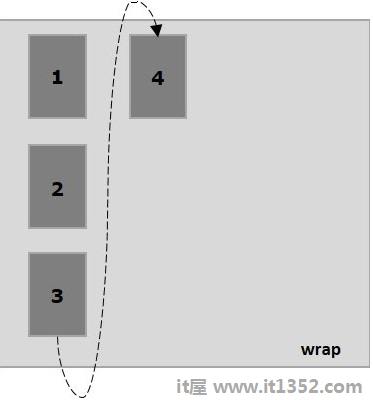
以下示例演示将值包装传递给flex-wrap属性的结果。 在这里,我们使用flex-direction value列创建六个具有不同颜色的框。
<!doctype html>
<html lang = "en">
   <style>
      .box1{background:green;}
      .box2{background:blue;}
      .box3{background:red;}
      .box4{background:magenta;}
      .box5{background:yellow;}
      .box6{background:pink;}

      .box{
         font-size:35px;
         padding:15px;
         width:100px;
      }
      .container{
         display:flex;
         border:3px solid black;
         flex-direction:column;
         flex-wrap:wrap;
         height:100vh;
      }
   </style>

   <body>
      <div class = "container">
         <div class = "box box1">One</div>
         <div class = "box box2">two</div>
         <div class = "box box3">three</div>
         <div class = "box box4">four</div>
         <div class = "box box5">five</div>
         <div class = "box box6">six</div>
      </div>
   </body>
</html>在将值wrap-reverse传递给属性flex-wrap并将value列传递给属性flex-direction时,容器的元素从左到右水平排列,如下所示。
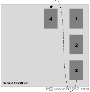
以下示例演示将值wrap-reverse传递给flex-wrap属性的结果。 在这里,我们创建了六个具有不同颜色的框和带有flex-direction值列的框。
<!doctype html>
<html lang = "en">
   <style>
      .box1{background:green;}
      .box2{background:blue;}
      .box3{background:red;}
      .box4{background:magenta;}
      .box5{background:yellow;}
      .box6{background:pink;}

      .box{
         font-size:35px;
         padding:15px;
         width:100px;
      }
      .container{
         display:flex;
         border:3px solid black;
         flex-direction:column;
         flex-wrap:wrap-reverse;
         height:100vh;
      }
   </style>

   <body>
      <div class = "container">
         <div class = "box box1">One</div>
         <div class = "box box2">two</div>
         <div class = "box box3">three</div>
         <div class = "box box4">four</div>
         <div class = "box box5">five</div>
         <div class = "box box6">six</div>
      </div>
   </body>
</html>