使用输出类计算/可视化Tensorflow Keras Dense模型层的相对连接权重 [英] Calculate/Visualize Tensorflow Keras Dense model layer relative connection weights w.r.t output classes
问题描述
这是我的tensorflow keras模型,(如果让事情变得艰难,则可以忽略辍学层)
Here is my tensorflow keras model,(you can ignore dropout layer if it makes things tough)
import tensorflow as tf
optimizers = tf.keras.optimizers
Sequential = tf.keras.models.Sequential
Dense = tf.keras.layers.Dense
Dropout = tf.keras.layers.Dropout
to_categorical = tf.keras.utils.to_categorical

model = Sequential()
model.add(Dense(256, input_shape=(20,), activation="relu"))
model.add(Dropout(0.1))
model.add(Dense(256, activation="relu"))
model.add(Dropout(0.1))
model.add(Dense(256, activation="relu"))
model.add(Dropout(0.1))
model.add(Dense(3, activation="softmax"))

adam = optimizers.Adam(lr=1e-3) # I don't mind rmsprop either
model.compile(optimizer=adam, loss='categorical_crossentropy', metrics=['accuracy'])
model.summary()
并且我将模型的结构和权重另存为
and I have saved the model structure and weights as
model.save("sim_score.h5", overwrite=True)
model.save_weights('sim_score_weights.h5', overwrite=True)
做model.predict(X_test)时得到[0.23, 0.63, 0.14],这是3种输出类别的预测概率.
on doing model.predict(X_test) I get [0.23, 0.63, 0.14] which is the prediction probability of the 3 output classes.
我如何形象地看待我最初的20个体重/重要性 该模型具有3个输出softmax吗?
How would I visualize how much weight/importance each of my initial 20 features have in this model w.r.t the 3 output softmax?
例如,我的第二列对最终结果的影响可忽略不计,而第五列对输出预测的影响则比第20列大3倍.不管第5列的绝对作用是什么,只要弄清楚相对重要性就足够了,例如5th column = 0.3, 20th column = 0.1等等,对于20 x 3 matrix.
For example, my 2nd column could have negligible impact on the end result, while the 5th column could have 3x more impact on the output prediction than the 20th column. It does not matter what the absolute effect of the 5th column is, just figuring out the relative importance is good enough, for example 5th column = 0.3, 20th column = 0.1 and so on for a 20 x 3 matrix.
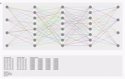
有关直觉,请参见此动画或
See this animation for intuition or Tensorflow playground. The visualization doesn't have to show how the weights change during training, but can just show a snapshot image of how it looks at the end of training.
实际上,该解决方案甚至不必是可视化的,它可以 甚至是20个元素x 3个输出的数组,每个元素的相对重要性 该功能具有3个输出softmax和相对于其他功能的重要性.
In fact, the solution does not even have to be a visualization, it can even be an array of 20 elements x 3 outputs having the relative importance of each feature w.r.t the 3 output softmax and importance relative to the other features.
获得中间层的重要性只是一个额外的奖励.
Getting the importance of intermediate layers is just an added bonus.
我之所以要可视化这20个功能,是出于透明目的(当前该模型感觉像一个黑匣子).我对matplotlib,pyplot和seaborn感到很满意. 我也知道Tensorboard,但是找不到带有Softmax的简单Dense Relu网络的任何示例.
The reason I want to visualize the 20 features is for transparency purposes(currently the model feels like a black box). I am comfortable in matplotlib, pyplot, seaborn. I am aware of Tensorboard as well, but couldn't find any examples for simple Dense Relu network with Softmax.
我觉得获取20 x 3权重的一个耗时方法是通过发送各种输入并尝试推断特征的重要性来从0 - 1的0 - 1中以0.5的增量进行20 features的域搜索基于此(可能会增加3 to the power of 20〜= 3.4 billion可能的样本空间,并且我添加的更多功能会成倍恶化),然后应用条件概率对相对权重进行逆向工程,但是我不确定是否存在通过TensorBoard或一些自定义逻辑更简单/优化的方式.
I feel a time-consuming way to get the 20 x 3 weights would be to do a domain search of 20 features from 0 - 1 with delta of 0.5 by sending various inputs and trying to deduce the importance of features based off of that(which would have 3 to the power of 20 ~= 3.4 billion possible sample space and gets exponentially worse the more features I add) and then applying conditional probability to reverse engineer the relative weights, but I am not sure if there is a simpler/optimized way via TensorBoard or some custom logic.
有人能帮助可视化模型/计算20个要素的20 x 3 = 60相对权重而没有带有代码段的3个输出,或提供有关如何实现此目的的参考吗?
Can someone help visualize the model/calculate the 20 x 3 = 60 relative weights of the 20 features w.r.t the 3 outputs with code snippets or provide a reference on how to achieve this?
推荐答案
我遇到了类似的问题,但我更关心模型参数(权重和偏差)的可视化,而不是模型特征[因为我也想浏览和查看黑框].
I had come across a similar problem, but i was concerned more about the visualization of the model parameters(weights and biases) rather than the model features [since i wanted to explore and view the black box as well].
例如,以下是具有2个隐藏层的浅层神经网络的摘要.
For example, the following is a snippet of a shallow neural network with 2 hidden layers.
model = Sequential()
model.add(Dense(128, input_dim=13, kernel_initializer='uniform', activation='relu'))
model.add(Dropout(0.1))
model.add(Dense(64, kernel_initializer='uniform', activation='relu'))
model.add(Dropout(0.1))
model.add(Dense(64, kernel_initializer='uniform', activation='relu'))
model.add(Dropout(0.1))
model.add(Dense(8, kernel_initializer='uniform', activation='softmax'))

# Compile model
model.compile(loss='sparse_categorical_crossentropy', optimizer='adam', metrics=['accuracy'])

# Using TensorBoard to visualise the Model
ks=TensorBoard(log_dir="/your_full_path/logs/{}".format(time()), histogram_freq=1, write_graph=True, write_grads=True, batch_size=10)

# Fit the model
model.fit(X, Y, epochs = 64, shuffle = True, batch_size=10, verbose = 2, validation_split=0.2, callbacks=[ks])
要使参数可视化,需要牢记一些重要的事情:
For one to be able to visualize the parameters, there are few important things to be kept in mind:
-
始终确保在model.fit()函数中有一个validation_split [无法直观显示其他直方图].
Always ensure to have a validation_split in the model.fit() function[else histograms cannot be visualised].
确保始终始终 histogram_freq> 0 的值![否则将不会计算直方图].
Make sure the value of histogram_freq > 0 always!![histograms won't be computed otherwise].
必须在model.fit()中将TensorBoard的回调指定为列表.
The callbacks to TensorBoard have to be specified in the model.fit() as a list.
完成一次; goto cmd并输入以下命令:
Once, this is done; goto cmd and type the folllowing command:
tensorboard --logdir = logs/
tensorboard --logdir=logs/
这为您提供了一个本地地址,您可以使用该地址在Web浏览器上访问TensorBoard. 所有直方图,分布,损失和准确性功能都将以图表形式提供,并且可以从顶部的菜单栏中进行选择.
This gives you a local address with which you can access TensorBoard on your web browser. All histograms, distributions, loss and accuracy functions will be available as plots and can be selected from the menu bar at the top.
希望这个答案能给出有关可视化模型参数的过程的提示(由于以上几点无法同时使用,我本人有些挣扎).
Hope this answer gives a hint about the procedure to visualize model parameters(I myself had a bit of a struggle as the above points weren't available together).
请告诉我是否有帮助.
下面是keras文档链接供您参考:
Below is the keras documentation link for your reference:
https://keras.io/callbacks/#tensorboard
这篇关于使用输出类计算/可视化Tensorflow Keras Dense模型层的相对连接权重的文章就介绍到这了,希望我们推荐的答案对大家有所帮助,也希望大家多多支持IT屋!
