在Matlab中具有密度的散点图 [英] Scatter plot with density in Matlab
问题描述
我想在一个垂直图中绘制数据集1和数据集2.不幸的是,数据量巨大,因此只是点涂片,看不到密度.我尝试了hist3和其他建议,但它覆盖了我的数据集,合并看上去很糟糕.
I would like to plot data set 1 and data set 2 in one plot vertical. Unfortunately the data is huge, so it is just a smear of points and can't see the density. I tried hist3 and other suggestions but it overwrites my data sets and the binning looks awful.
还有另一种绘制散布密度图的方法吗?真的没有Matlab功能吗?如果没有,我可以使用哪个程序轻松生成这样的图?
Is there another way to plot scatter density plots? Is there really no Matlab function for it? If not, which program could I use to easy generate such a plot?
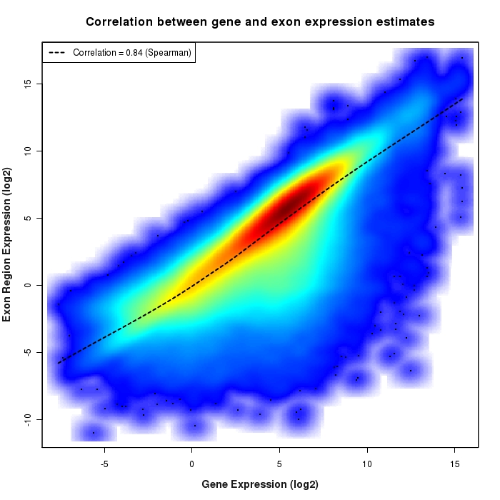
这两个示例之间的混合:
A mix between this two examples:
(来源: bcgsc. ca )
(source: bcgsc.ca)
推荐答案
感谢 @Emil Albert 进行更正(缺少移调)
Thanks to @Emil Albert for a correction (a transpose was missing)
data1 = randn(1,1e5); %// example data
data2 = randn(1,1e5) + .5*data1 ; %// example data correlated to above
values = hist3([data1(:) data2(:)],[51 51]);
imagesc(values.')
colorbar
axis equal
axis xy
如果要使与真实数据值一致的轴:请使用hist3的第二个输出来获取仓中心的位置,并将其传递给imagesc:
If you want to have the axes in accordance with the true data values: use the second output of hist3 to obtain the positions of the bin centers, and pass them to imagesc:
data1 = randn(1,1e5); %// example data
data2 = 2*randn(1,1e5) + 1.2*data1 + 4; %// example data correlated to above
[values, centers] = hist3([data1(:) data2(:)],[51 51]);
imagesc(centers{:}, values.')
colorbar
axis xy
这篇关于在Matlab中具有密度的散点图的文章就介绍到这了,希望我们推荐的答案对大家有所帮助,也希望大家多多支持IT屋!
