创建动态网格时防止div增长/拉伸 [英] Prevent div growing/stretching when creating a dynamic grid
问题描述
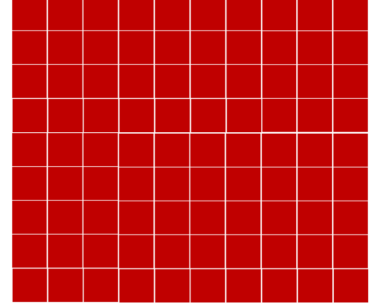
我正在处理动态图像网格,但无法将网格保留在容器中.这个想法很简单,使用jQuery在容器中添加任意数量的框,并在添加框后将其缩小以适合容器,而无需添加滚动条或退出屏幕.这是在添加列的过程中进行的,但是在添加行时,它只会在屏幕底部运行.
I am working on a dynamic image grid, and I cannot get the grid to stay in a container. The idea is rather simple, add as many boxes to the container as I like, using jQuery, and as they are added, shrink them to fit the container without adding scroll bars, or running off the screen. This is working with adding columns but when adding rows it just keep running off the bottom of the screen.
如何修复容器div,以便在添加行时缩小图像,而不是在滚动条上添加行?
How do I fix the container div so as rows are added, the image shrinks instead of adding rows with scrollbars?
function GenerateGrid(rows, cols) {
// Get the available space of the container.
var gridContainerH = $('#container').height();
var gridContainerW = $('#container').width();
// Adjust the image size to fit in the available space.
var imageWidth = gridContainerW / cols;
var imageHeight = gridContainerH / rows;
const container = document.getElementById("container");
var img = document.createElement("img");
img.src = "panel.jpg";
container.style.setProperty('--grid-rows', rows);
container.style.setProperty('--grid-cols', cols);
for (i = 0; i < (rows * cols); i++) {
let cell = document.createElement("div");
cell.innerHTML = '<img src=box.jpg width=' + imageWidth + ' height=' + imageHeight + '>';
container.appendChild(cell).className = "grid-item";
};
// Recalculate height
var panelHeight = imageWidth * rows;
$('#container').height(panelHeight);
$('#gridContainer').height(panelHeight);
};
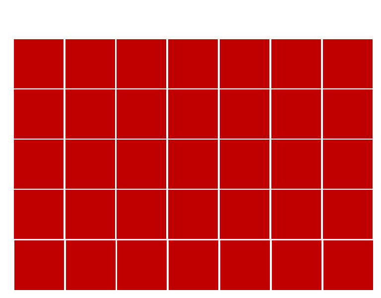
// Start with a 5x7 grid
$(window).on("load", function() {
GenerateGrid(5, 7);
})
// If the column amount changes, rebuild the grid.
$('#columns').change(function() {
var columns = $("#columns").val();
var rows = $("#rows").val();
$('#container').empty();
GenerateGrid(rows, columns);
});
// If the row amount changes, rebuild the grid.
$('#rows').change(function() {
var columns = $("#columns").val();
var rows = $("#rows").val();
$('#container').empty();
GenerateGrid(rows, columns);
});:root {
--grid-cols: 1;
--grid-rows: 1;
}
#container {
display: grid;
grid-gap: 0em;
grid-template-rows: repeat(var(--grid-rows), 0fr);
grid-template-columns: repeat(var(--grid-cols), 0fr);
}
#gridContainer {
width: 768px;
height: 600px;
max-height: 600px;
}
#staticContainer {
width: 768px;
height: 600px;
max-height: 600px;
}
.grid-item {
padding: 0em;
text-align: center;
}<link href="https://cdnjs.cloudflare.com/ajax/libs/twitter-bootstrap/4.5.0/css/bootstrap.min.css" rel="stylesheet"/>
<script src="https://cdnjs.cloudflare.com/ajax/libs/jquery/3.3.1/jquery.min.js"></script>
<div class="container-fluid">
<div class="row">
<div class="col-lg-2">
<form>
<label for="columns">Columns</label>
<input type="number" id="columns" name="columns" value="7">
<label for="rows">Rows</label>
<input type="number" id="rows" name="rows" value="5">
</form>
</div>
<div class="col-lg-10">
<div class="container" id="gridContainer">
<div class="row">
<div class="col-lg-8 text-center">
Horizontal label
</div>
</div>
<div class="row h-100">
<div class="col-lg-1 my-auto">
Vertical label
</div>
<div class="col-lg-7 staticContainer">
<div id="container"></div>
</div>
<div class="col-lg-4 mt-auto">
Right Side
</div>
</div>
</div>
</div>
</div>
</div>为网格创建不会超出定义的宽度和高度的Div容器涉及什么?
What is involved with creating a Div container for the grid that will not grow beyond defined width and height?
请以图片为例.
推荐答案
以避免在评论中链接:.这是您要尝试做的吗?:
to avoid a link in a comment : . is this what you try to do ? :
(已添加结构修改+ bs4类)
function GenerateGrid(rows, cols) {

  // Get the available space of the container.
  var gridContainerH = $('#container').height();
  var gridContainerW = $('#container').width();

  // Adjust the image size to fit in the available space.
  var imageWidth = gridContainerW / cols;
  var imageHeight = gridContainerH / rows;

  const container = document.getElementById("container");
  var img = document.createElement("img");
  img.src = "panel.jpg";

  container.style.setProperty('--grid-rows', rows);
  container.style.setProperty('--grid-cols', cols);
  for (i = 0; i < (rows * cols); i++) {
    let cell = document.createElement("div");
    cell.innerHTML = '<img src=box.jpg width=' + imageWidth + ' height=' + imageHeight + '>';
    container.appendChild(cell).className = "grid-item";
  };

  // Recalculate height
  var panelHeight = imageWidth * rows;
  $('#container').height(panelHeight);
  $('#gridContainer').height(panelHeight);

};

// Start with a 5x7 grid
$(window).on("load", function() {
  GenerateGrid(5, 7);
})

// If the column amount changes, rebuild the grid.
$('#columns').change(function() {
  var columns = $("#columns").val();
  var rows = $("#rows").val();
  $('#container').empty();
  GenerateGrid(rows, columns);
});

// If the row amount changes, rebuild the grid.
$('#rows').change(function() {
  var columns = $("#columns").val();
  var rows = $("#rows").val();
  $('#container').empty();
  GenerateGrid(rows, columns);
});
:root {
--grid-cols: 1;
--grid-rows: 1;
}
#container {
flex:1;
display: grid;
grid-gap: 0em;
grid-template-rows: repeat(var(--grid-rows), 0fr);
grid-template-columns: repeat(var(--grid-cols), 0fr);
}
#staticContainer {/* width sizing ? while col-lg-7 ?
Added to parent flex-shrink-0 flex-wrap classes but unsure of what you really want */
width: 768px;
height: 600px;
text-align:center;
}
.grid-item {
padding: 0em;
text-align: center;
}<link href="https://cdnjs.cloudflare.com/ajax/libs/twitter-bootstrap/4.5.0/css/bootstrap.min.css" rel="stylesheet" />
<script src="https://cdnjs.cloudflare.com/ajax/libs/jquery/3.3.1/jquery.min.js"></script>
<div class="container-fluid">
<div class="row">
<div class="col-lg-2">
<form>
<label for="columns">Columns</label>
<input type="number" id="columns" name="columns" value="7">
<label for="rows">Rows</label>
<input type="number" id="rows" name="rows" value="5">
</form>
</div>
<div class="col-lg-10 d-flex align-items-center flex-shrink-0 flex-wrap">
<div class="col-lg-1">Vertical label</div>
<div class="col-lg-7 d-flex flex-column" id="staticContainer">
<div>Horizontal label</div>
<div id="container"></div>
</div>
<div class="col-lg-4">
Right Side
</div>
</div>
</div>
</div>使用具有断点和固定大小的类,否则会使预期的渲染真正令人困惑……您能否阐明预期的大小和行为?
using classes with a break point and fixed size else where makes the expected render really confusing ... Could you clarify expected size and behavior ?
对象适合度也是一个提示吗?
would object-fit be a hint too ?
function GenerateGrid(rows, cols) {

  // Get the available space of the container.
  var gridContainerH = $('#container').height();
  var gridContainerW = $('#container').width();

  // Adjust the image size to fit in the available space.
  var imageWidth = gridContainerW / cols;
  var imageHeight = gridContainerH / rows;

  const container = document.getElementById("container");
  var img = document.createElement("img");
  img.src = "http://dummyimage.com/100x200&text=panel.jpg";

  container.style.setProperty('--grid-rows', rows);
  container.style.setProperty('--grid-cols', cols);
  for (i = 0; i < (rows * cols); i++) {
    let cell = document.createElement("div");
    cell.innerHTML = '<img src="http://dummyimage.com/100x200&text=box.jpg" width=' + imageWidth + ' height=' + imageHeight + '>';
    container.appendChild(cell).className = "grid-item";
  };

  // Recalculate height
  var panelHeight = imageWidth * rows;
  $('#container').height(panelHeight);
  $('#gridContainer').height(panelHeight);

};

// Start with a 5x7 grid
$(window).on("load", function() {
  GenerateGrid(5, 7);
})

// If the column amount changes, rebuild the grid.
$('#columns').change(function() {
  var columns = $("#columns").val();
  var rows = $("#rows").val();
  $('#container').empty();
  GenerateGrid(rows, columns);
});

// If the row amount changes, rebuild the grid.
$('#rows').change(function() {
  var columns = $("#columns").val();
  var rows = $("#rows").val();
  $('#container').empty();
  GenerateGrid(rows, columns);
});
:root {
--grid-cols: 1;
--grid-rows: 1;
}
#container {
flex:1;
display: grid;
grid-gap: 0em;
grid-template-rows: repeat(var(--grid-rows), 0fr);
grid-template-columns: repeat(var(--grid-cols), 0fr);
}
#staticContainer {/* width sizing ? while col-lg-7 ?
Added to parent flex-shrink-0 flex-wrap classes but unsure of what you really want */
width: 768px;
height: 600px;
text-align:center;
}
.grid-item {
padding: 0em;
text-align: center;
}
.grid-item img {object-fit:cover;display:block}<link href="https://cdnjs.cloudflare.com/ajax/libs/twitter-bootstrap/4.5.0/css/bootstrap.min.css" rel="stylesheet" />
<script src="https://cdnjs.cloudflare.com/ajax/libs/jquery/3.3.1/jquery.min.js"></script>
<div class="container-fluid">
<div class="row">
<div class="col-lg-2">
<form>
<label for="columns">Columns</label>
<input type="number" id="columns" name="columns" value="7">
<label for="rows">Rows</label>
<input type="number" id="rows" name="rows" value="5">
</form>
</div>
<div class="col-lg-10 d-flex align-items-center flex-shrink-0 flex-wrap">
<div class="col-lg-1">Vertical label</div>
<div class="col-lg-7 d-flex flex-column" id="staticContainer">
<div>Horizontal label</div>
<div id="container"></div>
</div>
<div class="col-lg-4">
Right Side
</div>
</div>
</div>
</div>这篇关于创建动态网格时防止div增长/拉伸的文章就介绍到这了,希望我们推荐的答案对大家有所帮助,也希望大家多多支持IT屋!
