有没有办法缩小设置高度的元素? [英] Is there a way to shrink an element with set height?
问题描述
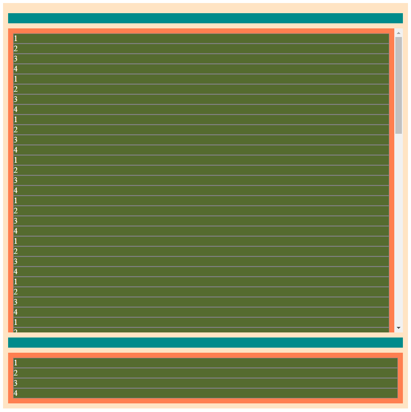
所以我真的不知道该问什么,但请听我说.我正在尝试制作一个div包装器(在图片中有一个怪异的背景),就像这样:
So I didn't really know what question to ask but hear me out. I was trying to make a div wrapper(it has a bisque background in the pictures) that would work like so:
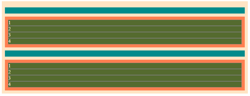
现在,以上布局使用固定高度来使用网格划分包装器.因此,如果我删除某些项目这就是我所得到的.
Now, the layout above uses a fixed height to divide the wrapper using grid. So if I remove some items this is what I get.
即使包装箱的高度固定,有没有办法将包装箱缩小到其内容?还是可以在不设置高度的情况下存档相同的结果?
Is there a way to shrink the wrapper to its content even though it has a fixed height? Or is it possible to archive the same result without setting the height?
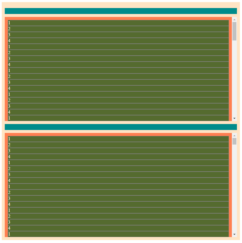
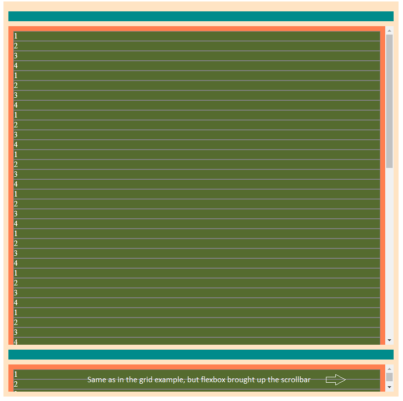
此外,这就是使用max-height的样子:一个列表溢出
Also, this is what using max-height instead looks like: One list overflowing
仅需列表中的几项内容,它就可以按照我的要求进行操作.但是我需要它来显示滚动条(如果溢出).所以我正在寻找两者的结合.
It works exactly how I want it with just a few items on the list. But I need it to show the scrollbar if overflown. So I'm looking for a combination of both.
对于那些想知道为什么我使用网格的人.Flex有相同的问题,还有一些不需要的空间分布.
And for those who wonder why did I use grid. Flex has the same issue plus some unwanted space distribution.
.wrapper {
  display: grid;
  grid-template-rows: repeat(max-content, 4);
  align-content: flex-start;
  margin: 0 auto;
  width: 80vh;
  height: 80vh;
  background-color: bisque;
  padding: 10px;
}

.header {
  background-color: darkcyan;
  padding: 10px;
  margin: 10px 0;
}

.list {
  background-color: coral;
  padding: 10px;
  overflow-y: auto;
}

.item {
  background-color: darkolivegreen;
  color: white;
  border: 1px solid gray;
}
<!DOCTYPE html>
<html lang="en">
<head>
<meta charset="UTF-8">
<meta name="viewport" content="width=device-width, initial-scale=1.0">
<title>Document</title>
</head>
<body>
<div class="wrapper">
<div class="header"></div>
<div class="list">
<div class="item">1</div>
<div class="item">2</div>
<div class="item">3</div>
<div class="item">4</div>
<div class="item">1</div>
<div class="item">2</div>
<div class="item">3</div>
<div class="item">4</div>
</div>
<div class="header"></div>
<div class="list">
<div class="item">1</div>
<div class="item">2</div>
<div class="item">3</div>
<div class="item">4</div>
<div class="item">1</div>
<div class="item">2</div>
<div class="item">3</div>
<div class="item">4</div>
</div>
</div>
</body>
</html>推荐答案
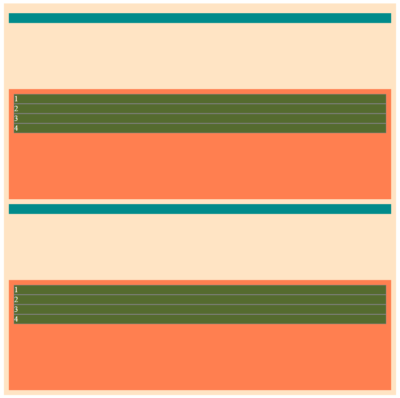
您需要使用max-height和grid-auto-rows来代替height和grid-template-rows:
You need to use max-height and grid-auto-rows instead height and grid-template-rows:
可能的例子
注意: 使每个列表的高度均匀(有点接近您的要求),可能需要JavaScript才能在某些点上重置行高.
.wrapper {
  display: grid;
   /* new / update */grid-auto-rows: auto minmax(auto,1fr);/* makes a repeating pattern of 2 rows */
  align-content: flex-start;
  margin: 0 auto;
  width: 80vh;
   /* new / update*/max-height: 80vh;
  overflow:hidden;
  background-color: bisque;
  padding: 10px;
}

.header {
  background-color: darkcyan;
  padding: 10px;
  margin: 10px 0;
}

.list {
  background-color: coral;
  padding: 10px;
  overflow-y: auto;
}

.item {
  background-color: darkolivegreen;
  color: white;
  border: 1px solid gray;
}
<div class="wrapper">
<div class="header"></div>
<div class="list">
<div class="item">1</div>
<div class="item">2</div>
<div class="item">3</div>
<div class="item">4</div>
<div class="item">1</div>
<div class="item">2</div>
<div class="item">3</div>
<div class="item">4</div>
</div>
<div class="header"></div>
<div class="list">
<div class="item">1</div>
<div class="item">2</div>
<div class="item">3</div>
<div class="item">4</div>
<div class="item">1</div>
<div class="item">2</div>
<div class="item">3</div>
<div class="item">4</div>
</div>
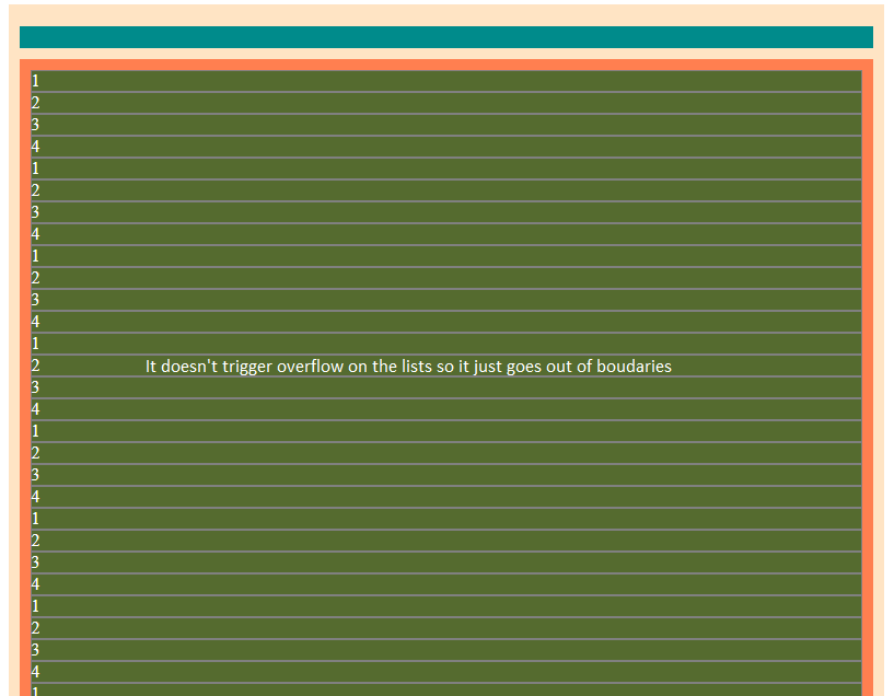
</div>//js的可能示例
let grid = document.querySelector('.wrapper');
let gridRows = document.querySelectorAll('.wrapper > .list');
let rowTpl = '';

for (let i = 0; i < gridRows.length; i++) {
  let rowH = gridRows[i].offsetHeight;
  rowTpl += (" auto  minmax(auto," + rowH + "fr ) ");
  grid.setAttribute("style", "--rowTpl:" + rowTpl)
}
body {
margin: 0;
}
.wrapper {
display: grid;
align-content: flex-start;
margin: 0 auto;
grid-template-rows: var(--rowTpl);
width: 80vh;
/* new / update*/
max-height: 90vh;
overflow: hidden;
background-color: bisque;
padding: 5px;
}
.header {
background-color: darkcyan;
padding: 10px;
margin: 5px 0;
}
.list {
background-color: coral;
padding: 5px;
overflow-y: auto;
}
.item {
background-color: darkolivegreen;
color: white;
border: 1px solid gray;
}<div class="wrapper">
<div class="header"></div>
<div class="list">
<div class="item">1</div>
<div class="item">2</div>
<div class="item">3</div>
<div class="item">4</div>
</div>
<div class="header"></div>
<div class="list">
<div class="item">1</div>
<div class="item">2</div>
<div class="item">3</div>
<div class="item">4</div>
<div class="item">1</div>
<div class="item">2</div>
<div class="item">3</div>
<div class="item">4</div>
</div>
</div>这篇关于有没有办法缩小设置高度的元素?的文章就介绍到这了,希望我们推荐的答案对大家有所帮助,也希望大家多多支持IT屋!
