在一个图中绘制光谱数据 [英] Plotting spectral data in one plot
问题描述
我有多个数据框,其中第一列(最后用 NA 填充)是波数,其他列是我的多个观察的特定波数变量.
是否有可能以我的第一列保存 x 轴变量的方式绘制列,而另一列则用它们各自的 y 值绘制成一个大图?
我已经尝试过matplot"(结果是数字"而不是点),
matplot(df[,1],df[,3:5],xlab = "波长 [nm]", ylab = "吸光度")不同的xyplot"集合(不可能给出一个以上的 y 值),但似乎没有一个有效(以我对 R 的知识水平).
最终结果应该类似于
编辑
我实际上是在网上偶然发现了您的数据集,因此我将介绍如何使用上面的代码绘制它.
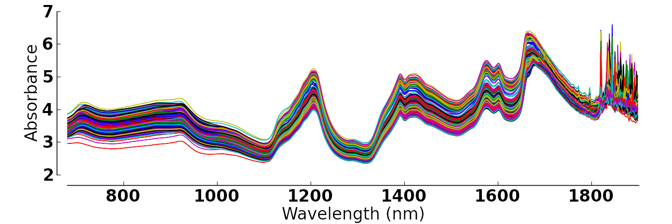
file <- 'http://openmv.net/file/tablet-spectra.csv'光谱 <- read.csv(file, header = FALSE)# 移除盒子标签光谱<-光谱[,-1]# 添加波长"并旋转 df#(我没有找到实际的波长值,但是嘿).光谱 <- cbind(1:ncol(spectra), t(spectra))plot_multi(光谱,y = 2:ncol(光谱),cols = Rainbow(ncol(光谱)),type='l', main=":))", ylab="吸光度", xlab = "'波长'")I'm having multiple data frames where the first column (in the end filled with NA's) is the wavenumber and the other columns are my variables of the specific wavenumber for multiple observations.
Is there a possibility to plot the columns in a way that my first column holds the variables for the x-axis and the other are plotted into one big plot with their respective y-values?
I already tried "matplot" (resulting in "numbers" instead of points),
matplot(df[,1],df[,3:5],xlab = "Wavelength [nm]", ylab = "Absorbance")
different sets of "xyplot" (no possibility to give more than one y-value), but none seem to work (on my level of knowledge on R).
The final result should look like this.
Thanks for any help!
You could always make your own function to do this ;I make such functions on a regular basis when nothing really fits my needs. I put this together rather quickly but you can adapt it to your needs.
# generate data
set.seed(6)
n <- 50
dat <- data.frame(x1=seq(1,100, length.out = n),
                  x2=seq(1,20, length.out = n)+rnorm(n),
                  x3=seq(1,20, length.out = n)+rnorm(n, mean = 3),
                  x4=seq(1,20, length.out = n)+rnorm(n, mean = 5))
# make some NAs at the end
dat[45:n,2] <- NA
dat[30:n,3] <- NA


plot_multi <- function(df, x=1, y=2, cols=y,
                       xlim=range(df[,x], na.rm = T),
                       ylim=range(df[,y], na.rm = T),
                       main="", xlab="", ylab="", ...){
  # setup plot frame
  plot(NULL,
       xlim=xlim,
       ylim=ylim,
       main=main, xlab=xlab, ylab=ylab)

  # plot all your y's against your x
  pb <- sapply(seq_along(y), function(i){
    points(df[,c(x, y[i])], col=cols[i], ...)
  })
}

plot_multi(dat, y=2:4, type='l', lwd=3, main = ":)",
           xlab = "Wavelength", ylab = "Absorbance")
Results in :
EDIT
I actually found your dataset online by chance, so I'll include how to plot it as well using my code above.
file <- 'http://openmv.net/file/tablet-spectra.csv'
spectra <- read.csv(file, header = FALSE)

# remove box label
spectra <- spectra[,-1]

# add the 'wavelength' and rotate the df
# (i didn't find the actual wavelength values, but hey).
spectra <- cbind(1:ncol(spectra), t(spectra))

plot_multi(spectra, y=2:ncol(spectra), cols = rainbow(ncol(spectra)),
           type='l', main=":))", ylab="Absorbance", xlab = "'Wavelength'")
这篇关于在一个图中绘制光谱数据的文章就介绍到这了,希望我们推荐的答案对大家有所帮助,也希望大家多多支持IT屋!
