Silverlight的自定义自定义的Tabcontrol设计 [英] Silverlight custom Tabcontrol Design
问题描述
我是新手发展和打算开发使用Silverlight基于Windows的项目。
I am Newbie to development and am going to develop a Windows-based project using Silverlight.
我选择作出OOB应用程序(silerlight出浏览器应用程序)。在我的项目,我将使用一个TabControl。
I chose to make an OOB app (silerlight Out Of Browser application). In my project I am going to use a TabControl.
我能够显示与MSDN文档的帮助下一个TabControl,并动态加入的TabControl的TabItems。
I am able to display a TabControl with the help of MSDN document and have Dynamically added TabItems in TabControl.
我的问题是
在我的TabControl只有一个TabItem的应该是固定的喜欢谷歌浏览器加号按钮,但找不到此任何教程或文件。如果我发现任何东西,可能是第三方的TabControl。
in my TabControl only one TabItem should be fixed like Google chrome Plus button but couldn't find any tutorials or documentation for this. If I found anything that may be a third party tabcontrol.
还有一件事,如果我添加更多的TabItems我希望它被添加到新的生产线,而不是滚动。
and one more thing, if I add more TabItems I want it to be added to new line instead of scrolling.
请提供一些指导来解决我的问题。
Please provide some guidance to fix my problems.
推荐答案
如果你的意思是像这些图像(以 + 按钮任何标签的右边):
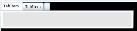
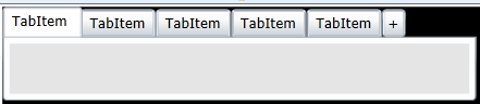
If you mean something like these images (with a + button to the right of any tabs):
我用混合编辑TabItem的模板,并把TabPanelTop控制部分成水平堆叠面板和部件后添加一个按钮。 XAML下面的模板,但变化是这一部分:
I used blend to edit the TabItem template and put the TabPanelTop control part into a horizontal stack panel and added a button after the part. Xaml for the template below but the change is this part:
  <StackPanel Orientation="Horizontal">
       <System_Windows_Controls_Primitives:TabPanel x:Name="TabPanelTop" Canvas.ZIndex="1" Height="24"/>
       <Button Content="+" Width="20"/>
  </StackPanel>
全面修改的TabControl模板的XAML
Full modified TabControl template Xaml
<UserControl.Resources>
    <Style x:Key="TabControlStyle1" TargetType="sdk:TabControl">
        <Setter Property="IsTabStop" Value="False"/>
        <Setter Property="Background">
            <Setter.Value>
                <LinearGradientBrush EndPoint="0.5,1" StartPoint="0.5,0">
                    <GradientStop Color="#FFFFFFFF" Offset="0"/>
                    <GradientStop Color="#FFFEFEFE" Offset="1"/>
                </LinearGradientBrush>
            </Setter.Value>
        </Setter>
        <Setter Property="BorderBrush">
            <Setter.Value>
                <LinearGradientBrush EndPoint="0.5,1" StartPoint="0.5,0">
                    <GradientStop Color="#FFA3AEB9" Offset="0"/>
                    <GradientStop Color="#FF8399A9" Offset="0.375"/>
                    <GradientStop Color="#FF718597" Offset="0.375"/>
                    <GradientStop Color="#FF617584" Offset="1"/>
                </LinearGradientBrush>
            </Setter.Value>
        </Setter>
        <Setter Property="BorderThickness" Value="1"/>
        <Setter Property="Padding" Value="5"/>
        <Setter Property="HorizontalContentAlignment" Value="Stretch"/>
        <Setter Property="VerticalContentAlignment" Value="Stretch"/>
        <Setter Property="Template">
            <Setter.Value>
                <ControlTemplate TargetType="sdk:TabControl">
                    <Grid>
                        <VisualStateManager.VisualStateGroups>
                            <VisualStateGroup x:Name="CommonStates">
                                <VisualStateGroup.Transitions>
                                    <VisualTransition GeneratedDuration="0"/>
                                </VisualStateGroup.Transitions>
                                <VisualState x:Name="Normal"/>
                                <VisualState x:Name="Disabled">
                                    <Storyboard>
                                        <DoubleAnimationUsingKeyFrames Storyboard.TargetProperty="Opacity" Storyboard.TargetName="DisabledVisualTop">
                                            <SplineDoubleKeyFrame KeyTime="0" Value="1"/>
                                        </DoubleAnimationUsingKeyFrames>
                                        <DoubleAnimationUsingKeyFrames Storyboard.TargetProperty="(UIElement.Opacity)" Storyboard.TargetName="DisabledVisualBottom">
                                            <SplineDoubleKeyFrame KeyTime="0" Value="1"/>
                                        </DoubleAnimationUsingKeyFrames>
                                        <DoubleAnimationUsingKeyFrames Storyboard.TargetProperty="(UIElement.Opacity)" Storyboard.TargetName="DisabledVisualLeft">
                                            <SplineDoubleKeyFrame KeyTime="0" Value="1"/>
                                        </DoubleAnimationUsingKeyFrames>
                                        <DoubleAnimationUsingKeyFrames Storyboard.TargetProperty="(UIElement.Opacity)" Storyboard.TargetName="DisabledVisualRight">
                                            <SplineDoubleKeyFrame KeyTime="0" Value="1"/>
                                        </DoubleAnimationUsingKeyFrames>
                                    </Storyboard>
                                </VisualState>
                            </VisualStateGroup>
                        </VisualStateManager.VisualStateGroups>
                        <Grid x:Name="TemplateTop" Visibility="Collapsed">
                            <Grid.RowDefinitions>
                                <RowDefinition Height="Auto"/>
                                <RowDefinition Height="*"/>
                            </Grid.RowDefinitions>
                            <StackPanel Orientation="Horizontal">
                                <System_Windows_Controls_Primitives:TabPanel x:Name="TabPanelTop" Canvas.ZIndex="1" Height="24"/>
                                <Button Content="+" Width="20"/>
                            </StackPanel>
                            <Border BorderBrush="{TemplateBinding BorderBrush}" BorderThickness="{TemplateBinding BorderThickness}" Background="{TemplateBinding Background}" CornerRadius="0,0,3,3" MinWidth="10" MinHeight="10" Grid.Row="1">
                                <ContentPresenter x:Name="ContentTop" Cursor="{TemplateBinding Cursor}" HorizontalAlignment="{TemplateBinding HorizontalAlignment}" Margin="{TemplateBinding Padding}" VerticalAlignment="{TemplateBinding VerticalAlignment}"/>
                            </Border>
                            <Border x:Name="DisabledVisualTop" Background="#8CFFFFFF" CornerRadius="0,0,3,3" IsHitTestVisible="False" Opacity="0" Grid.Row="1" Grid.RowSpan="2" Canvas.ZIndex="1"/>
                        </Grid>
                        <Grid x:Name="TemplateBottom" Visibility="Collapsed">
                            <Grid.RowDefinitions>
                                <RowDefinition Height="*"/>
                                <RowDefinition Height="Auto"/>
                            </Grid.RowDefinitions>
                            <System_Windows_Controls_Primitives:TabPanel x:Name="TabPanelBottom" Margin="2,-1,2,2" Grid.Row="1" Canvas.ZIndex="1"/>
                            <Border BorderBrush="{TemplateBinding BorderBrush}" BorderThickness="{TemplateBinding BorderThickness}" Background="{TemplateBinding Background}" CornerRadius="3,3,0,0" MinWidth="10" MinHeight="10">
                                <ContentPresenter x:Name="ContentBottom" Cursor="{TemplateBinding Cursor}" HorizontalAlignment="{TemplateBinding HorizontalAlignment}" Margin="{TemplateBinding Padding}" VerticalAlignment="{TemplateBinding VerticalAlignment}"/>
                            </Border>
                            <Border x:Name="DisabledVisualBottom" Background="#8CFFFFFF" CornerRadius="3,3,0,0" IsHitTestVisible="False" Opacity="0" Canvas.ZIndex="1"/>
                        </Grid>
                        <Grid x:Name="TemplateLeft" Visibility="Collapsed">
                            <Grid.ColumnDefinitions>
                                <ColumnDefinition Width="Auto"/>
                                <ColumnDefinition Width="*"/>
                            </Grid.ColumnDefinitions>
                            <System_Windows_Controls_Primitives:TabPanel x:Name="TabPanelLeft" Margin="2,2,-1,2" Canvas.ZIndex="1"/>
                            <Border BorderBrush="{TemplateBinding BorderBrush}" BorderThickness="{TemplateBinding BorderThickness}" Background="{TemplateBinding Background}" Grid.Column="1" CornerRadius="0,3,3,0" MinWidth="10" MinHeight="10">
                                <ContentPresenter x:Name="ContentLeft" Cursor="{TemplateBinding Cursor}" HorizontalAlignment="{TemplateBinding HorizontalAlignment}" Margin="{TemplateBinding Padding}" VerticalAlignment="{TemplateBinding VerticalAlignment}"/>
                            </Border>
                            <Border x:Name="DisabledVisualLeft" Background="#8CFFFFFF" Grid.Column="1" CornerRadius="0,3,3,0" IsHitTestVisible="False" Opacity="0" Canvas.ZIndex="1"/>
                        </Grid>
                        <Grid x:Name="TemplateRight" Visibility="Collapsed">
                            <Grid.ColumnDefinitions>
                                <ColumnDefinition Width="*"/>
                                <ColumnDefinition Width="Auto"/>
                            </Grid.ColumnDefinitions>
                            <System_Windows_Controls_Primitives:TabPanel x:Name="TabPanelRight" Grid.Column="1" Margin="-1,2,2,2" Canvas.ZIndex="1"/>
                            <Border BorderBrush="{TemplateBinding BorderBrush}" BorderThickness="{TemplateBinding BorderThickness}" Background="{TemplateBinding Background}" CornerRadius="3,0,0,3" MinWidth="10" MinHeight="10">
                                <ContentPresenter x:Name="ContentRight" Cursor="{TemplateBinding Cursor}" HorizontalAlignment="{TemplateBinding HorizontalAlignment}" Margin="{TemplateBinding Padding}" VerticalAlignment="{TemplateBinding VerticalAlignment}"/>
                            </Border>
                            <Border x:Name="DisabledVisualRight" Background="#8CFFFFFF" CornerRadius="3,0,0,3" IsHitTestVisible="False" Margin="0" Opacity="0" Canvas.ZIndex="1"/>
                        </Grid>
                    </Grid>
                </ControlTemplate>
            </Setter.Value>
        </Setter>
    </Style>
</UserControl.Resources>
当涉及到模板编辑甚至程序员应该了解和喜爱的Expression Blend。它可能看起来像一个只有设计师的工具,但它是值得其黄金所见即所得的编辑权重
When it comes to template editing even coders should get to know and love Expression Blend. It may seem like a designer-only tool, but it is worth its weight in gold for the WYSIWYG editing.
*注意:这并没有解决应对的问题按下按钮,但我知道你可以的模板绑定的按钮的命令,附加属性以及视图模型,从而使应该是至少你的问题了。
*Note: This does not address the issue of responding to the button press, but I know you can template bind a button's command to attached properties as well as view models, so that should be the least of your problems now.
这篇关于Silverlight的自定义自定义的Tabcontrol设计的文章就介绍到这了,希望我们推荐的答案对大家有所帮助,也希望大家多多支持IT屋!
