Python使用Pandas或NumPy滚动Sharpe比率 [英] Python rolling Sharpe ratio with Pandas or NumPy
问题描述
我正在尝试使用Python和Pandas/NumPy生成6个月滚动夏普比率的图.
I am trying to generate a plot of the 6-month rolling Sharpe ratio using Python with Pandas/NumPy.
我的输入数据如下:
import pandas as pd
import numpy as np
import matplotlib.pyplot as plt
import seaborn as sns
sns.set_style("whitegrid")

# Generate sample data
d = pd.date_range(start='1/1/2008', end='12/1/2015')
df = pd.DataFrame(d, columns=['Date'])
df['returns'] = np.random.rand(d.size, 1)
df = df.set_index('Date')
print(df.head(20))

             returns
Date
2008-01-01  0.232794
2008-01-02  0.957157
2008-01-03  0.079939
2008-01-04  0.772999
2008-01-05  0.708377
2008-01-06  0.579662
2008-01-07  0.998632
2008-01-08  0.432605
2008-01-09  0.499041
2008-01-10  0.693420
2008-01-11  0.330222
2008-01-12  0.109280
2008-01-13  0.776309
2008-01-14  0.079325
2008-01-15  0.559206
2008-01-16  0.748133
2008-01-17  0.747319
2008-01-18  0.936322
2008-01-19  0.211246
2008-01-20  0.755340
我想要的
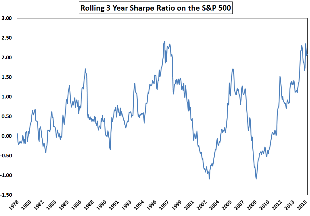
我要制作的情节类型为此或从这里开始的第一个情节(请参见下文).
The type of plot I am trying to produce is this or the first plot from here (see below).
我的尝试
这是我正在使用的方程式:
Here is the equation I am using:
def my_rolling_sharpe(y):
    return np.sqrt(126) * (y.mean() / y.std()) # 21 days per month X 6 months = 126

# Calculate rolling Sharpe ratio
df['rs'] = calc_sharpe_ratio(df['returns'])

fig, ax = plt.subplots(figsize=(10, 3))
df['rs'].plot(style='-', lw=3, color='indianred', label='Sharpe')\
        .axhline(y = 0, color = "black", lw = 3)

plt.ylabel('Sharpe ratio')
plt.legend(loc='best')
plt.title('Rolling Sharpe ratio (6-month)')
fig.tight_layout()
plt.show()
问题是我得到一条水平线,因为我的函数为夏普比率指定了一个值.对于所有日期,此值均相同.在示例图中,它们似乎显示出很多比率.
The problem is that I am getting a horizontal line since my function is giving a single value for the Sharpe ratio. This value is the same for all the Dates. In the example plots, they appear to be showing many ratios.
问题
是否可以绘制一个从一天到第二天变化的6个月滚动Sharpe比率?
Is it possible to plot a 6-month rolling Sharpe ratio that changes from one day to the next?
推荐答案
使用df.rolling和180天的固定窗口大小的近似正确的解决方案:
Approximately correct solution using df.rolling and a fixed window size of 180 days:
df['rs'] = df['returns'].rolling('180d').apply(my_rolling_sharpe)
由于rolling需要固定的窗口大小,因此该窗口的宽度不完全是6个日历月,因此尝试window='6MS'(在 S 上有6个 M 一个ValueError.
This window isn't exactly 6 calendar months wide because rolling requires a fixed window size, so trying window='6MS' (6 Month Starts) throws a ValueError.
要计算一个窗口正好6个日历月的夏普比率,我将复制SO用户的这个超酷的答案迈克:
To calculate the Sharpe ratio for a window exactly 6 calendar months wide, I'll copy this super cool answer by SO user Mike:
df['rs2'] = [my_rolling_sharpe(df.loc[d - pd.offsets.DateOffset(months=6):d, 'returns'])
             for d in df.index]

# Compare the two windows
df.plot(y=['rs', 'rs2'], linewidth=0.5)
这篇关于Python使用Pandas或NumPy滚动Sharpe比率的文章就介绍到这了,希望我们推荐的答案对大家有所帮助,也希望大家多多支持IT屋!
