R?中不规则间隔的风数据的流线型 [英] Streamlines for irregular spaced wind data in R?
问题描述
我有一些电台的风数据.数据包括csv文件中每个站点的站点纬度,经度,风速和风向.此数据不是规则间隔的数据.我需要使用R语言为此数据绘制流线型.
I have got wind data for some stations. The data includes station latitude, longitude, wind speed and wind direction for each station in a csv file. This data is not regularly spaced data. I have a requirement to draw streamlines for this data in R language.
我通过Internet搜索尝试了STREAMPLOT(),TeachingDemos和My.Symbols的两个软件包rasterVis,但是我没有成功.
I tried couple of packages rasterVis for STREAMPLOT(), TeachingDemos for My.Symbols by searching through internet, however I was not successful.
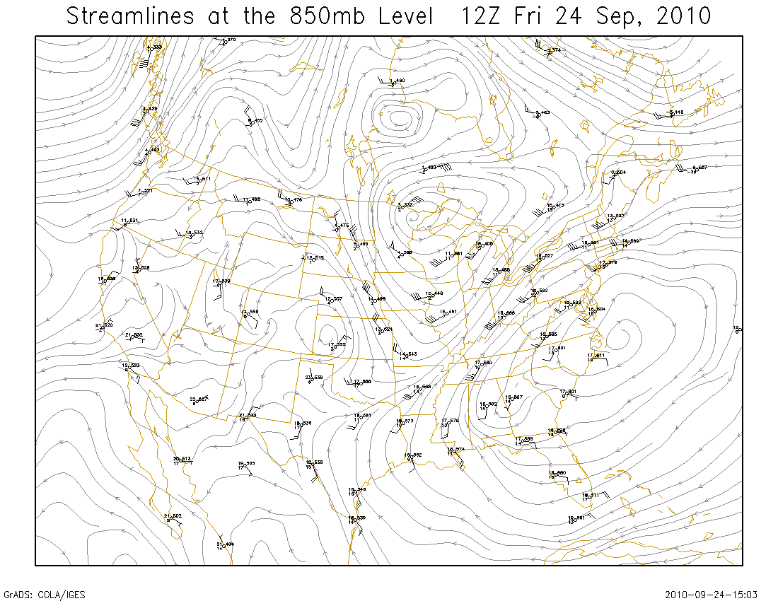
这是我正在谈论的示例情节. http://wx.gmu.edu/dev/clim301/850stream.png
Here is an example plot I was talking about. http://wx.gmu.edu/dev/clim301/850stream.png
这也是我试图绘制流线的csv文件中的一些示例数据.
Also here is some sample data from csv file that I got for which I was trying to draw streamlines.
longitude,latitude,windspeed,winddirection
84.01,20,1.843478261,126.6521739
77.13,28.48,3.752380952,138.952381
77.2,28.68,2.413333333,140.2666667
78.16,31.32,1.994444444,185.0555556
77.112,31.531,2.492,149.96
77,28.11,7.6,103
77.09,31.5,1.752631579,214.8947368
76.57,31.43,1.28,193.6
77.02,32.34,3.881818182,264.4545455
77.15,28.7,2.444,146.12
77.35,30.55,3.663157895,131.3684211
75.5,29.52,4.175,169.75
72.43,24.17,2.095,279.3
76.19,25.1,1.816666667,170
76.517,30.975,1.284210526,125.6315789
76.13,28.8,4.995,126.7
75.04,29.54,4.09,151.85
72.3,24.32,0,359
72.13,23.86,1.961111111,284.7777778
74.95,30.19,3.032,137.32
73.16,22.36,1.37,251.8
75.84,30.78,3.604347826,125.8695652
73.52,21.86,1.816666667,228.9166667
70.44,21.5,2.076,274.08
69.75,21.36,3.81875,230
78.05,30.32,0.85625,138.5625
有人可以帮助我绘制不规则风力数据的流线型吗?
Can someone please help me out in drawing streamlines for the irregular wind data?
推荐答案
像您一样,我想可视化与streamlnes相同类型的数据,但是我没有找到能够完成上述任务的函数...所以我努力了我自己的原始函数:
Like you, I wanted to visualize the same kind of data as streamlnes and I failed to find a function that would do the trick...so I worked up my own crude function:
streamlines <- function(x, y, u, v, step.dist=NULL,
                        max.dist=NULL, col.ramp=c("white","black"),
                        fade.col=NULL, length=0.05, ...) {

  ## Function for adding smoothed vector lines to a plot.
  ## Interpolation powered by akima package

  ## step.distance - distance between interpolated locations (user coords)
  ## max.dist - maximum length of interpolated line (user coords)
  ## col.ramp - colours to be passed to colorRampPalette
  ## fade.col - NULL or colour to add fade effect to interpolated line
  ## ... - further arguments to pass to arrows

  ## build smoothed lines using interp function
  maxiter <- max.dist/step.dist
  l <- replicate(5, matrix(NA, length(x), maxiter), simplify=FALSE)
  names(l) <- c("x","y","u","v","col")
  l$x[,1] <- x
  l$y[,1] <- y
  l$u[,1] <- u
  l$v[,1] <- v
  for(i in seq(maxiter)[-1]) {
    l$x[,i] <- l$x[,i-1]+(l$u[,i-1]*step.dist)
    l$y[,i] <- l$y[,i-1]+(l$v[,i-1]*step.dist)
    r <- which(l$x[,i]==l$x[,i-1] & l$y[,i]==l$y[,i-1])
    l$x[r,i] <- NA
    l$y[r,i] <- NA
    for(j in seq(length(x))) {
      if(!is.na(l$x[j,i])) {
        l$u[j,i] <- c(interp(x, y, u, xo=l$x[j,i], yo=l$y[j,i])$z)
        l$v[j,i] <- c(interp(x, y, v, xo=l$x[j,i], yo=l$y[j,i])$z)
      }
    }
  }

  ## make colour a function of speed and fade line
  spd <- sqrt(l$u^2 + l$v^2) # speed
  spd <- apply(spd, 1, mean, na.rm=TRUE) # mean speed for each line
  spd.int <- seq(min(spd, na.rm=TRUE), max(spd, na.rm=TRUE), length.out=maxiter)
  cr <- colorRampPalette(col.ramp)
  cols <- as.numeric(cut(spd, spd.int))
  ncols <- max(cols, na.rm=TRUE)
  cols <- cr(ncols)[cols]
  if(is.null(fade.col)) {
    l$col <- replicate(maxiter, cols)
  } else {
    nfade <- apply(!is.na(l$x), 1, sum)
    for(j in seq(length(x))) {
      l$col[j,seq(nfade[j])] <- colorRampPalette(c(fade.col, cols[j]))(nfade[j])
    }
  }

  ## draw arrows
  for(j in seq(length(x))) {
    arrows(l$x[j,], l$y[j,], c(l$x[j,-1], NA), c(l$y[j,-1], NA),
           col=l$col[j,], length=0, ...)
    i <- which.max(which(!is.na(l$x[j,]))) # draw arrow at end of line
    if(i>1) {
      arrows(l$x[j,i-1], l$y[j,i-1], l$x[j,i], l$y[j,i],
             col=l$col[j,i-1], length=length, ...)
    }
  }

}
此功能由 akima 包,并且经过一些摆弄,它可以产生一半的不错的视觉效果:
The function is powered by the interp function in the akima package and, with some fiddling, it can produce some half decent visuals:
dat <- "longitude,latitude,windspeed,winddirection
84.01,20,1.843478261,126.6521739
77.13,28.48,3.752380952,138.952381
77.2,28.68,2.413333333,140.2666667
78.16,31.32,1.994444444,185.0555556
77.112,31.531,2.492,149.96
77,28.11,7.6,103
77.09,31.5,1.752631579,214.8947368
76.57,31.43,1.28,193.6
77.02,32.34,3.881818182,264.4545455
77.15,28.7,2.444,146.12
77.35,30.55,3.663157895,131.3684211
75.5,29.52,4.175,169.75
72.43,24.17,2.095,279.3
76.19,25.1,1.816666667,170
76.517,30.975,1.284210526,125.6315789
76.13,28.8,4.995,126.7
75.04,29.54,4.09,151.85
72.3,24.32,0,359
72.13,23.86,1.961111111,284.7777778
74.95,30.19,3.032,137.32
73.16,22.36,1.37,251.8
75.84,30.78,3.604347826,125.8695652
73.52,21.86,1.816666667,228.9166667
70.44,21.5,2.076,274.08
69.75,21.36,3.81875,230
78.05,30.32,0.85625,138.5625"

tf <- tempfile()
writeLines(dat, tf)
dat <- read.csv(tf)

library(rgdal) # for projecting locations to utm coords
library(akima) # for interpolation

## add utm coords
xy <- as.data.frame(project(cbind(dat$longitude, dat$latitude), "+proj=utm +zone=43 +datum=NAD83"))
names(xy) <- c("easting","northing")
dat <- cbind(dat, xy)

## add u and v coords
dat$u <- -dat$windspeed*sin(dat$winddirection*pi/180)
dat$v <- -dat$windspeed*cos(dat$winddirection*pi/180)


#par(bg="black", fg="white", col.lab="white", col.axis="white")
plot(northing~easting, data=dat, type="n", xlab="Easting (m)", ylab="Northing (m)")
streamlines(dat$easting, dat$northing, dat$u, dat$v,
            step.dist=1000, max.dist=50000, col.ramp=c("blue","green","yellow","red"),
            fade.col="white", length=0, lwd=5)
这篇关于R?中不规则间隔的风数据的流线型的文章就介绍到这了,希望我们推荐的答案对大家有所帮助,也希望大家多多支持IT屋!
